


E-commerce success isn’t just about driving traffic – it’s about converting that traffic into paying customers. Businesses spend thousands, even millions, on advertising, SEO, and social media marketing, only to lose potential customers due to hidden conversion roadblocks. What’s worse is that many store owners don’t even realize it’s happening.
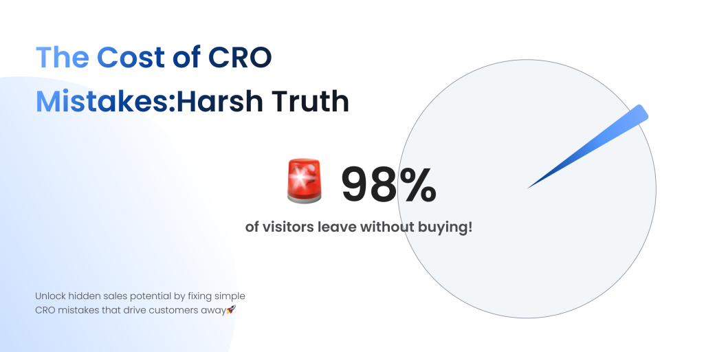
The average e-commerce conversion rate is shockingly low, hovering between 2 and 3 percent. This means that out of every 100 visitors, fewer than three actually complete a purchase. The remaining 97 leave, often due to avoidable issues. What if you could increase that conversion rate to 4, 5, or even 6 percent? The impact on revenue would be significant, with no additional spending on ads or traffic acquisition.
The problem is that many businesses focus on the wrong areas. They invest in more marketing, assuming that more visitors will equal more sales. In reality, if your website is full of friction points – slow loading speeds, a frustrating checkout experience, or weak calls to action – more traffic will only lead to more missed opportunities. Instead of throwing money at getting more visitors, optimizing the existing traffic is the smarter and more cost-effective strategy.
Conversion Rate Optimization (CRO) is about fine-tuning every element of your online store to reduce friction, build trust, and guide visitors toward completing a purchase. The difference between a store that converts well and one that doesn’t often comes down to a handful of critical factors.
This article will walk you through the seven biggest CRO mistakes that could be silently killing your sales, backed by real-world data and actionable solutions. From slow website speed to weak trust signals and ineffective checkout processes, we’ll break down why these mistakes happen, how they impact conversions, and – most importantly – how you can fix them.
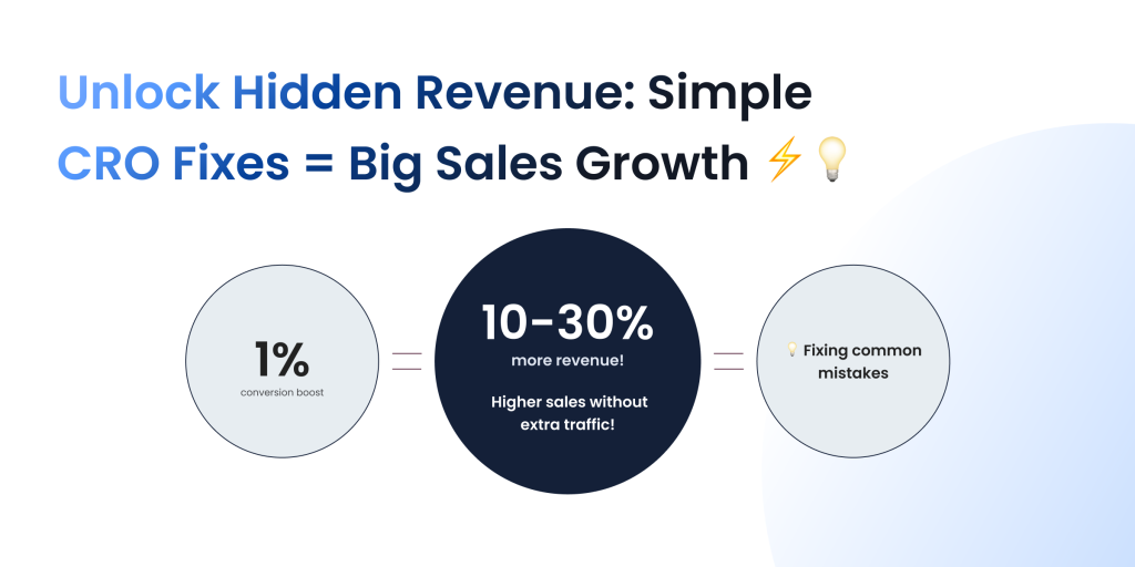
Even a 1% increase in conversion rate can lead to significant revenue growth. By the end of this guide, you’ll have a clear roadmap to turn more of your visitors into paying customers without spending a dollar more on traffic.
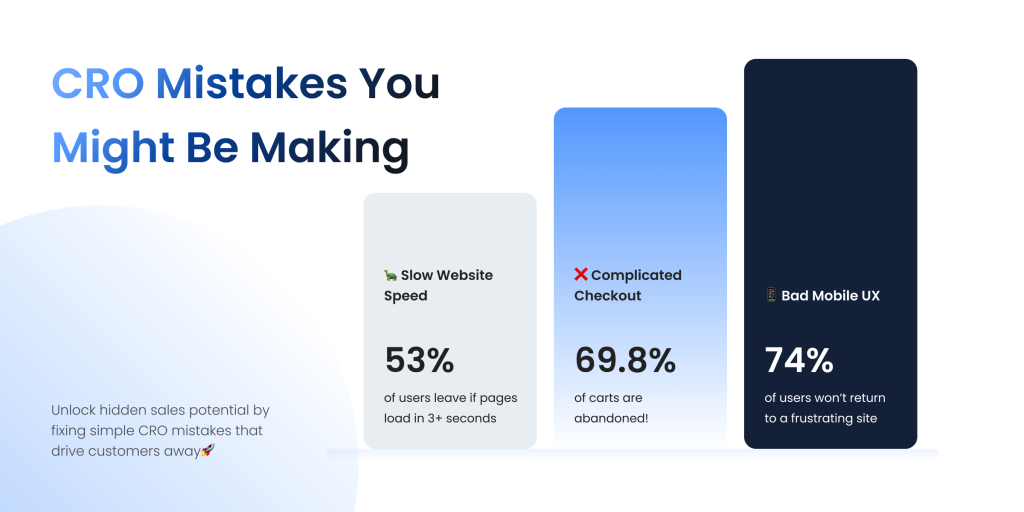
Mistake #1: Slow Website Speed – The Silent Revenue Killer
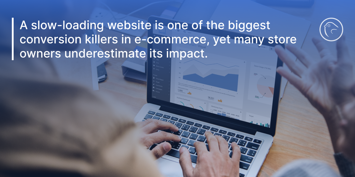
A slow-loading website is one of the biggest conversion killers in e-commerce, yet many store owners underestimate its impact. Studies show that if a website takes more than three seconds to load, over 53% of mobile users will abandon it. Even a one-second delay can decrease conversion rates by 7%, meaning that a sluggish site is directly costing businesses revenue.
Beyond losing customers, slow speeds also hurt search rankings. Google prioritizes fast-loading websites in search results, meaning that an underperforming store is likely losing both organic traffic and conversions. Customers today expect instant browsing experiences – if a competitor’s site loads faster, that’s where they’ll shop.
So, what slows websites down? The most common culprits include:
- Unoptimized images that are too large and take too long to load.
- Bloated code and excessive plugins that slow down processing.
- Lack of caching and a Content Delivery Network (CDN) to optimize performance.
- Slow hosting services that cannot handle spikes in traffic.
These issues add up, making every page load feel sluggish and frustrating for potential buyers.
How to Fix It
- Optimize Images Without Sacrificing Quality
- Convert images to WebP format instead of JPEG/PNG for faster loading.
- Use lazy loading so images only load when they appear on-screen.
- Minimize Excessive Code & Plugins
- Remove unused CSS and JavaScript that slow down processing.
- Audit and disable unnecessary third-party plugins.
- Use Caching & a CDN for Faster Content Delivery
- Enable browser caching to store data locally and reduce load times.
- Use a CDN like Cloudflare to serve content from the closest server location.
- Upgrade to High-Performance Hosting
- Choose dedicated or cloud hosting for faster response times.
- Ensure servers can handle traffic surges during peak sales seasons.
By implementing these optimizations, e-commerce businesses can create a faster, smoother experience that keeps customers engaged and reduces lost sales. A high-speed store isn’t just about user experience – it’s a direct driver of higher conversions and revenue growth.
Mistake #2: Poor Mobile Experience – Losing Customers on the Go
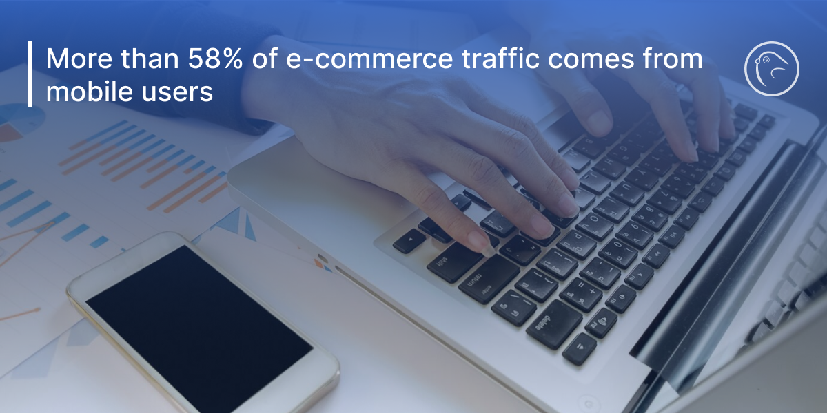
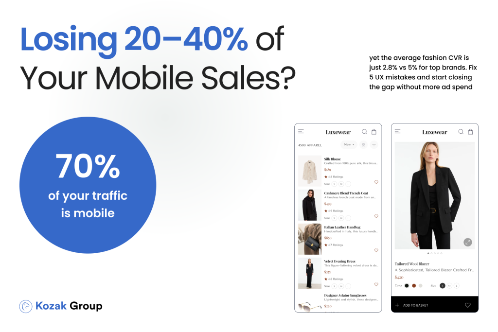
In today’s mobile-driven world, having a fast and well-optimized website isn’t enough – it needs to be seamless on mobile devices. More than 58% of e-commerce traffic comes from mobile users, yet conversion rates on mobile are typically lower than desktop. Why? Because many online stores fail to provide an optimized mobile experience, leading to frustration, high bounce rates, and lost sales.
If a visitor lands on your store from their phone and encounters tiny buttons, difficult navigation, intrusive popups, or a checkout process that requires endless typing, they’re far more likely to abandon their purchase. Studies show that 74% of users say they are less likely to return to a site that is not mobile-friendly. Even worse, Google penalizes websites that are not optimized for mobile, pushing them lower in search rankings.
Common signs that your mobile experience is hurting conversions include:
- Pinch-and-zoom required to read text or tap on buttons.
- Menus and navigation are cluttered, making it difficult to find products.
- Popups block content, making it hard for users to browse.
- Slow mobile load times, leading to frustrated users abandoning the page.
How to Fix It
- Adopt a Mobile-First Design
- Ensure buttons, links, and text are large enough to tap easily.
- Use sticky navigation so users can always access the menu or cart.
- Streamline the Checkout Process for Mobile Users
- Enable one-click checkout options like Apple Pay, Google Pay, or PayPal.
- Use autofill and saved payment details to reduce typing.
- Offer a guest checkout option to speed up transactions.
- Optimize Mobile Load Speed
- Compress images and use lazy loading to improve performance.
- Use AMP (Accelerated Mobile Pages) to speed up mobile browsing.
- Test Your Store Across Different Devices
- Regularly check your store on iOS, Android, and tablets to ensure a consistent experience.
A frictionless mobile experience is no longer optional – it’s essential for maximizing conversions. By ensuring that your store is fast, easy to navigate, and effortless to check out on mobile, you can capture more sales and stay ahead of the competition.
Mistake #3: Complicated Checkout Process – The Silent Conversion Killer
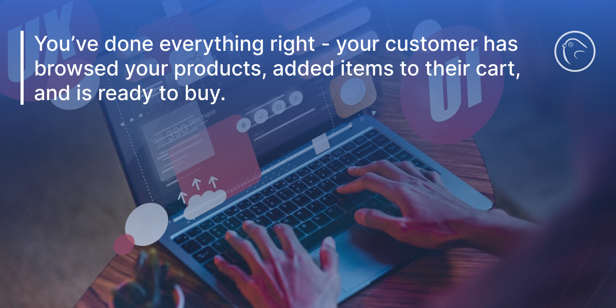
You’ve done everything right – your customer has browsed your products, added items to their cart, and is ready to buy. But then, something happens. They abandon their cart and leave your site without completing the purchase. This scenario plays out millions of times a day across e-commerce stores worldwide.
In fact, 69.8% of all shopping carts are abandoned, meaning nearly 7 out of 10 potential customers never complete their purchase. The checkout process is often the biggest barrier to conversions, and the more complicated it is, the more customers you lose.
What causes checkout abandonment?
- Too many form fields – If a user has to fill out 10+ fields before making a purchase, frustration sets in.
- Forcing account creation – Not everyone wants to sign up for an account before buying.
- Hidden shipping costs – Unexpected fees at the final step cause users to back out.
- Slow checkout page load times – Even a few seconds of delay makes users rethink their decision.
- Limited payment options – If a user’s preferred payment method isn’t available, they may leave.
When a checkout process is too long, slow, or confusing, it creates friction, and customers decide it’s not worth their time. Even customers who were highly motivated to buy will drop off if the process is too complex or lacks trust signals.
How to Fix It
- Implement a One-Page Checkout
- Reduce the number of steps required to complete a purchase.
- Use a progress bar to indicate how close they are to finishing.
- Offer Guest Checkout
- Let users buy without creating an account to remove unnecessary friction.
- Be Transparent About Costs
- Show shipping costs and estimated delivery times upfront instead of surprising users at checkout.
- Add Multiple Payment Options
- Include credit cards, PayPal, Apple Pay, Google Pay, and Buy Now, Pay Later (BNPL) options.
- Speed Up Checkout Page Loading
- Optimize images, scripts, and remove unnecessary elements that slow it down.
- Increase Trust with Security Signals
- Display SSL certificates, secure payment icons, and customer reviews near the payment form.
A seamless checkout experience can significantly boost conversions and revenue.By reducing friction, simplifying steps, and building trust, you can turn more abandoned carts into completed sales.
Mistake #4: Weak Call-to-Actions (CTAs) – Losing Customers Due to Unclear Messaging
![]()
A well-designed e-commerce store with great products and smooth navigation still won’t convert if it lacks one critical element: a strong Call-to-Action (CTA). CTAs are what guide users toward making a purchase, signing up for a newsletter, or taking any other desired action. When they are weak, unclear, or buried in the design, users often leave without completing their journey.
The problem is that many online stores either don’t use CTAs effectively or fail to make them compelling enough. A button that simply says “Submit” or “Click Here” does nothing to excite or encourage action. Customers need clear, persuasive guidance that moves them toward purchasing with confidence.
Common CTA Mistakes That Kill Conversions
- Vague or Generic Language – CTAs like “Learn More”, “Next”, or “Continue” don’t inspire urgency or action.
- Poor Visibility – If your CTA blends into the page, users won’t notice it.
- Lack of Contrast – A CTA button that is the same color as the background gets ignored.
- No Sense of Urgency – Without a reason to act now, customers delay purchasing.
How to Fix It
1. Use Action-Oriented Language
CTAs should be specific, direct, and encourage immediate action. Instead of “Submit” or “Continue,” use:
“Get My Discount Now”
“Claim Your Free Trial”
“Buy Now – Limited Stock Available”
The wording should reflect the value or benefit the user will receive. For example, “Start Saving Today” is more enticing than “Sign Up.”
2. Make CTAs Visually Stand Out
- Use bold, high-contrast colors that catch the eye. The most effective colors are red, green, orange, and blue, depending on brand identity.
- Ensure CTAs are placed above the fold and repeated in key locations like product pages and checkout.
- Use white space around the CTA so it doesn’t blend into the design.
3. Create Urgency and Scarcity
- Limited-time offers encourage users to act now rather than later. Example:
“Only 3 Left in Stock – Order Now”
“Sale Ends in 2 Hours – Get 20% Off” - Highlighting demand works too: “5 People Are Viewing This Product Now” or “Bestseller – Selling Fast”.
4. Test and Optimize
A/B test different CTAs, colors, and placements to find what drives the most conversions. Even a small change, like tweaking a CTA from “Add to Cart” to “Get Yours Today”, can increase sales significantly.
A powerful CTA is one of the easiest, yet most overlooked, ways to boost conversions instantly. By making them clear, engaging, and action-driven, you create a smoother buying experience and turn more visitors into customers.
Mistake #5: Lack of Trust Signals – Customers Won’t Buy If They Don’t Trust You
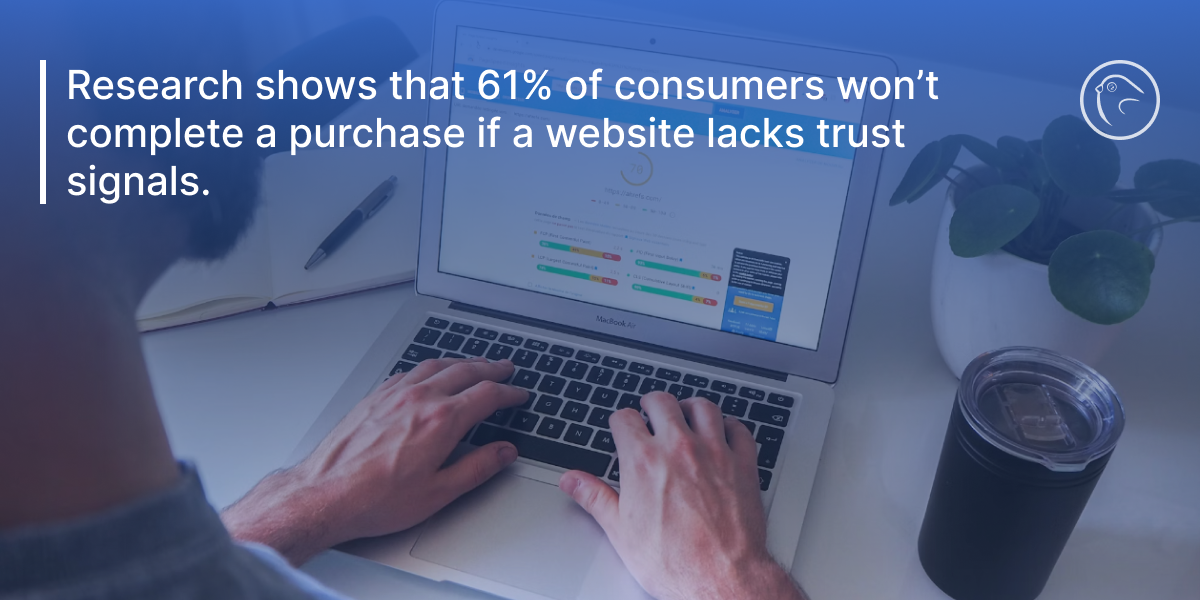
Trust is one of the most critical factors in e-commerce conversions. If visitors don’t feel confident about your store, they won’t complete their purchase – no matter how great your product or pricing is. The reality is that online shoppers are skeptical. With the rise of fraud, fake stores, and data breaches, customers want clear trust indicators before handing over their payment information.
Research shows that 61% of consumers won’t complete a purchase if a website lacks trust signals. Even more telling, stores that actively display security badges and customer reviews see conversion rates increase by as much as 30%. This means that simply adding visible credibility indicators can have a direct impact on revenue.
Common Signs Your Store Lacks Trust
- No customer reviews or testimonials – Shoppers rely on social proof to validate their decision.
- Unclear refund and return policies – If customers don’t know what happens if they’re unhappy, they hesitate.
- No visible security badges – A lack of SSL certificates, payment security logos, or trust seals makes users feel unsafe.
- Low-quality product images or missing descriptions – Shoppers need to see real details before committing to a purchase.
How to Fix It
1. Display Customer Reviews & Testimonials Prominently
- Include star ratings on product pages and allow verified buyers to leave reviews.
- Showcase testimonials and customer success stories on the homepage and product pages.
- Highlight real user-generated content, such as social media images of customers using your products.
2. Add Clear Return & Refund Policies
- Clearly state refund eligibility and timeframes (e.g., “30-Day Money-Back Guarantee”).
- Use simple, easy-to-read language – avoid legal jargon that confuses buyers.
- Display policies before checkout so customers don’t feel blindsided.
3. Use Trust Badges & Secure Payment Icons
- Display SSL security badges (e.g., Norton, McAfee, or a secure checkout seal).
- Show recognized payment options like Visa, Mastercard, PayPal, and Apple Pay.
- Add trust indicators like “Trusted by 10,000+ customers” to reinforce credibility.
4. Optimize Product Pages for Transparency
- Use high-resolution product images from multiple angles.
- Include detailed descriptions, sizing guides, and FAQs to address concerns before they arise.
- Add live chat support so users can get quick answers without hesitation.
Consumers are more cautious than ever, and building trust is essential for boosting conversions. By incorporating credibility indicators across your store, you can reduce customer hesitation, improve brand perception, and increase sales effortlessly.
Mistake #6: No A/B Testing – Guessing Instead of Optimizing
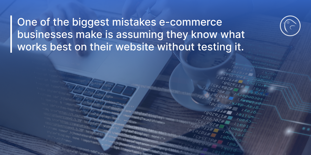
One of the biggest mistakes e-commerce businesses make is assuming they know what works best on their website without testing it. Many store owners design their site based on personal preferences, competitor analysis, or even intuition – without ever validating their decisions through data. This approach leads to missed opportunities and lower conversions.
A/B testing, also known as split testing, is the process of testing two versions of a webpage, CTA, product page, or checkout process to see which performs better. It removes the guesswork from CRO and allows businesses to make data-driven improvements that directly impact sales. Companies that use regular A/B testing report conversion rate increases of 20-30% over time, simply by refining elements based on customer behavior.
Common Signs You’re Not Using A/B Testing Effectively
- You launch site changes without measuring their impact.
- Your conversion rates have stagnated, but you don’t know why.
- You assume your CTAs, product descriptions, or layouts are optimal, without proof.
- You copy industry trends without testing how they perform for your audience.
How to Fix It
1. Start with High-Impact Tests
Not all A/B tests are created equal. Focus on key conversion points first:
- CTA Buttons – Test different wording (e.g., “Buy Now” vs. “Get Yours Today”), colors, and placements.
- Product Page Layouts – Experiment with larger images, different descriptions, and video demos.
- Checkout Optimization – Test one-page checkout vs. multi-step checkout.
- Pricing & Discounts – Try different discount structures (e.g., percentage-based vs. fixed dollar amounts).
2. Use A/B Testing Tools
Platforms like Google Optimize, Optimizely, and VWO allow businesses to run experiments without coding. These tools track visitor behavior and provide real-time data on which version performs better.
3. Run Tests for a Sufficient Timeframe
One of the biggest mistakes with A/B testing is ending tests too early. A test needs enough traffic and conversions to be statistically significant – otherwise, results can be misleading. A minimum of two weeks is recommended for meaningful insights.
4. Analyze & Apply Learnings
After completing a test, apply winning variations site-wide. Continue running new testsconsistently, as user behavior evolves over time.
A/B testing is one of the easiest and most cost-effective ways to improve conversions without increasing traffic. By regularly testing and refining key elements, businesses can boost sales, improve user experience, and maximize revenue effortlessly.
Mistake #7: Ignoring Personalization – One-Size-Fits-All Doesn’t Work
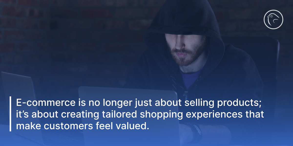
E-commerce is no longer just about selling products; it’s about creating tailored shopping experiences that make customers feel valued. Yet, many online stores treat all visitors the same, failing to deliver personalized recommendations, targeted messaging, or dynamic content that aligns with individual preferences. This mistake can significantly reduce conversions, as shoppers today expect websites to anticipate their needs and offer relevant suggestions.
Personalization in e-commerce isn’t just a trend – it’s a proven revenue driver. Studies show that 91% of consumers are more likely to shop with brands that provide relevant offers and recommendations. Additionally, businesses that implement personalization strategies see an average revenue increase of 10-30%. When customers feel like a store understands their needs, they are more likely to engage, purchase, and return for repeat business.
How Ignoring Personalization Hurts Conversions
- Customers struggle to find relevant products, leading to higher bounce rates.
- Generic promotions fail to attract repeat buyers who want exclusive offers.
- Product pages don’t adapt to user behavior, resulting in fewer add-to-cart actions.
- Lack of personalized email follow-ups means lost opportunities for abandoned cart recovery.
How to Fix It
1. Implement AI-Driven Product Recommendations
- Use AI to display “You May Also Like” or “Frequently Bought Together” product suggestions.
- Show recommendations based on past browsing history and purchase behavior.
- Use dynamic sections like “Trending Products in Your Area” or “Customers Like You Bought This”.
2. Personalize Discounts & Promotions
- Offer exclusive discounts for returning customers based on their purchase history.
- Use geo-targeting to display region-specific deals.
- Create custom bundles based on previous purchases.
3. Optimize Email Personalization
- Send cart abandonment emails with the exact products left behind.
- Use personalized subject lines (e.g., “John, Your Favorite Sneakers Are Back in Stock!”).
- Recommend products based on recent browsing activity.
4. Use Dynamic Content on Landing Pages
- Display homepage banners and offers based on user interests.
- Adapt category pages to highlight frequently viewed items.
- Show social proof, like “200 people bought this item today”, to boost urgency.
Personalization makes shopping feel effortless, engaging, and relevant. By leveraging AI-driven recommendations, targeted messaging, and dynamic content, e-commerce stores can boost conversions, increase retention, and maximize customer lifetime value. In today’s competitive market, treating every visitor the same isn’t an option – smart personalization is the key to driving sales and building brand loyalty.
Small CRO Mistakes, Big Revenue Losses – Time to Fix Them
Conversion Rate Optimization (CRO) isn’t just a marketing tactic – it’s the backbone of a successful e-commerce business. As we’ve seen, even the smallest friction points, from slow load speeds to weak CTAs, can drive potential customers away and leave significant revenue on the table. Businesses that fail to optimize their stores for user experience, trust, and personalization often struggle with high bounce rates, abandoned carts, and underwhelming sales performance.
The good news? Every CRO mistake is fixable, and even minor improvements can lead to substantial gains. Research shows that a 1% increase in conversion rate can translate into a 10-30% revenue boost – without spending more on traffic. Instead of chasing new visitors, optimizing the experience for existing users is the most cost-effective way to grow an e-commerce business.
Key Takeaways: How to Fix the 7 CRO Mistakes
- Optimize website speed to reduce bounce rates and improve customer experience.
- Enhance mobile responsiveness to capture the growing mobile-first audience.
- Simplify checkout processes to reduce cart abandonment and increase completed purchases.
- Create compelling CTAs that guide visitors toward action.
- Build trust with customer reviews, transparent policies, and security signals.
- Use A/B testing to remove the guesswork and make data-driven improvements.
- Leverage personalization to create a tailored shopping experience that drives sales.
 What’s Next? Let’s Improve Your Store’s Conversions
 What’s Next? Let’s Improve Your Store’s Conversions
At Kozak Group, we specialize in identifying and fixing conversion roadblocks that are costing businesses valuable sales. Our CRO experts analyze every aspect of your website, from UX design and speed optimization to checkout improvements and A/B testing, ensuring that more visitors turn into paying customers.
If your store is struggling with low conversion rates, high abandonment, or wasted marketing spend, now is the time to take action. Even small optimizations can lead to significant revenue growth.


 AI Dealbot
