

The Mobile-Desktop Conversion Paradox
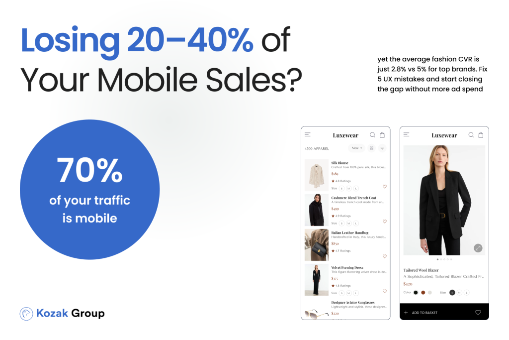
In fashion eCommerce, mobile is king when it comes to traffic – but not when it comes to revenue. Across Europe, mobile accounts for more than 70% of site visits for apparel and footwear brands (Statista, 2024). Social platforms like Instagram, TikTok, and Pinterest drive enormous mobile engagement, fueling discovery and brand awareness. Yet despite this overwhelming mobile traffic, conversion rates remain consistently lower compared to desktop.
According to Baymard Institute’s benchmarks, the average desktop conversion rate in retail is around 3%, while mobile lags behind at just 1.5-1.8%. That means brands are essentially converting only half of their mobile visitors into buyers, leaving a massive amount of potential revenue on the table. To make matters worse, mobile ad spend continues to rise sharply – European fashion retailers typically allocate over 60% of their performance marketing budgets to mobile channels (Shopify Plus Fashion Report, 2024). The result is a frustrating paradox: mobile drives traffic, but desktop drives sales.
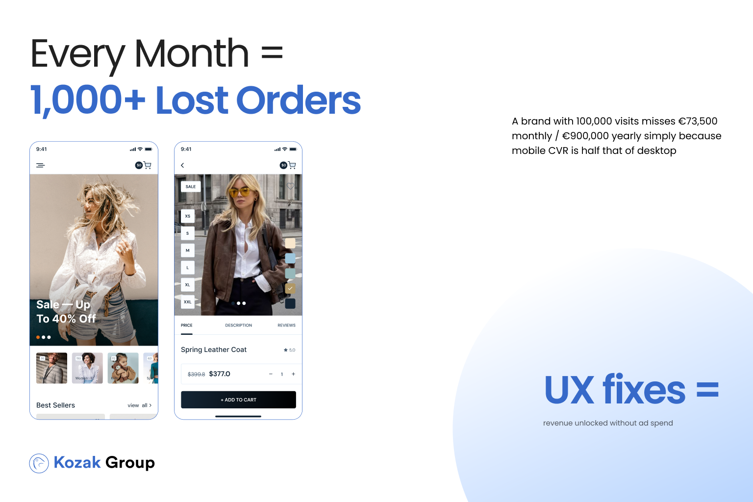
For Heads of eCommerce and eCommerce Managers, this is more than a technical challenge – it’s a direct hit on ROI. Imagine a mid-sized fashion brand with 100,000 monthly site visits, where 70,000 come from mobile. If desktop conversion holds steady at 3% and mobile lags at 1.5%, the brand is losing 1,050 potential orders every month. With an average order value (AOV) of €70, that’s €73,500 in lost revenue per month – or nearly €900,000 annually.
This isn’t a small leak in the funnel – it’s a gaping hole. And the harsh truth is that most of these missed sales have nothing to do with product quality, branding, or pricing. They’re lost because of preventable UX friction: slow loading times, clunky navigation, hidden product details, and checkout barriers that disproportionately hurt mobile users.
The good news? Closing the mobile-desktop conversion gap doesn’t require a full website rebuild. Targeted CRO improvements can lift mobile conversions by 0.5-1% within weeks, dramatically shifting the revenue balance without any additional ad spend. In this article, we’ll explore why the gap exists, what it costs your brand, and – most importantly – how you can fix it with actionable, data-driven UX improvements.
Read in our previous article:
The Best Platform for Ecommerce: Choosing What’s Right for Your Online Store
Why the Gap Exists: Core Problems in Fashion Mobile UX
If desktop users are converting at twice the rate of mobile users, the natural question is: why? The gap isn’t about intent-studies show that mobile shoppers are just as likely to purchase as desktop visitors when barriers are removed (Google Retail UX Playbook, 2023). Instead, the problem lies in mobile-specific friction points that make browsing and buying unnecessarily difficult.
1. Slow Site Speeds
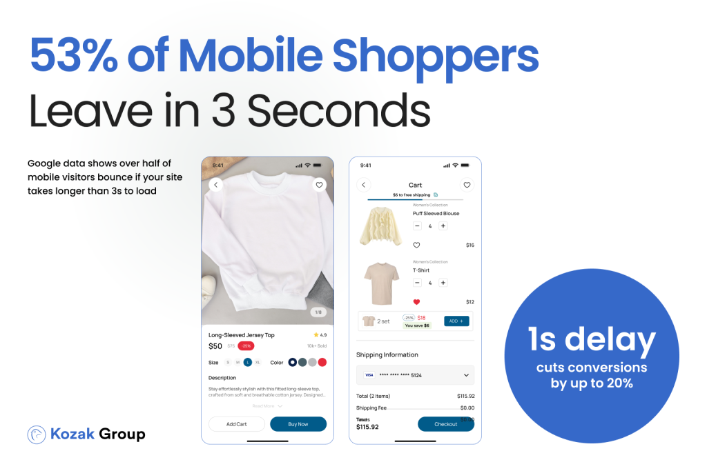
Speed is the number-one conversion killer on mobile. According to Google, 53% of mobile visitors abandon a site if it takes more than three seconds to load. Unfortunately, many fashion eCommerce sites are image-heavy and poorly optimized. Large product images, video content, and scripts often add seconds to load times. On desktop, this might be tolerable; on mobile, it’s abandonment.
2. Complex Navigation
Fashion catalogs often run into hundreds of SKUs across categories, colors, and sizes. On desktop, mega-menus and hover states make this manageable. On mobile, however, collapsing menus and tiny filter buttons frustrate shoppers. Baymard Institute reports that navigation and product-finding issues account for nearly 25% of mobile cart abandonment cases.
3. Checkout Friction
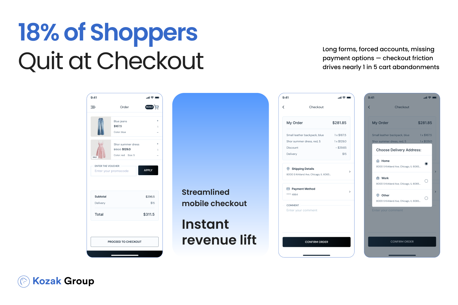
Checkout should be the easiest step of the customer journey. Instead, many mobile checkouts are designed like miniaturized versions of their desktop counterparts – long forms, mandatory account creation, and poorly optimized payment options. In fact, 18% of European online shoppers cite “too long/complicated checkout” as their reason for abandoning a purchase (Statista, 2024).
4. Hidden Product Information
Fashion is a high-consideration category. Customers want clarity on sizing, availability, delivery, and returns. On desktop, this information is usually visible without scrolling. On mobile, it’s often buried in dropdowns or hidden behind tabs. The result: uncertainty, hesitation, and lost sales.
5. Poor Visuals on Mobile
A picture sells a product in fashion – but only if the image loads correctly. Cropped product shots, missing zoom functionality, or unresponsive galleries create friction. Mobile users expect a swipe-and-zoom experience that mirrors social platforms. Without it, even strong products fail to convert.
Taken together, these issues explain why the mobile-desktop conversion gap persists. They aren’t flaws in consumer behavior; they’re UX mistakes. The next step is understanding the cost of ignoring them.
The Cost of Doing Nothing
For many fashion eCommerce leaders, the mobile-desktop conversion gap feels like an accepted reality – something that “just happens” in online retail. But the cost of ignoring it is staggering.
Let’s break it down with a simple scenario. Imagine your brand generates 100,000 monthly site visits. Industry averages suggest that about 70% of those visitors are on mobile. If your desktop conversion rate is 3% but mobile lags at 1.5%, here’s the math:
- Desktop (30,000 visits × 3%) = 900 orders
- Mobile (70,000 visits × 1.5%) = 1,050 orders
Now, if mobile performed at the same 3% as desktop, you’d see 2,100 mobile orders instead of 1,050. That’s 1,050 lost orders every single month.
Assuming an average order value (AOV) of €70, this translates to:
- 1,050 lost orders × €70 = €73,500 in lost revenue per month
- Or nearly €900,000 annually – gone simply because of UX friction
And this is a conservative estimate. Many fashion brands operate with AOVs well above €100, especially in footwear and luxury apparel. For them, the annual losses can easily cross €1.5-2 million.
It’s not just about revenue either. The wasted ad spend compounds the issue. European brands typically allocate over 60% of their paid media budgets to mobile acquisition (Shopify Plus Fashion Report, 2024). That means thousands of euros every month are spent driving traffic to a mobile experience that underperforms. In essence, you’re paying twice: once for the traffic, and again in opportunity cost when those visitors don’t convert.
And the gap is widening. As social commerce and mobile-first discovery continue to grow, desktop traffic is shrinking in relative importance. This means the financial penalty for poor mobile UX will only increase year over year.
The message is clear: doing nothing isn’t neutral – it’s actively costing your brand six or seven figures annually. The good news? Closing this gap is possible, and it doesn’t require a complete rebuild of your store.
How to Close the Gap: Actionable UX Fixes
The mobile-desktop conversion gap isn’t an unsolvable mystery. It’s the result of a set of recurring, well-documented UX flaws – and the fixes are clear. By addressing these issues systematically, fashion eCommerce managers can unlock significant conversion gains within weeks.
1. Optimize Speed First
Speed is non-negotiable. Google data shows that even a one-second delay can reduce conversions by up to 20%. For fashion sites, compressing images, using next-gen formats like WebP, lazy-loading product visuals, and implementing a content delivery network (CDN) can shave seconds off mobile load times. Regular audits with tools like Google Lighthouse or GTmetrix should be part of your workflow.
2. Simplify Navigation and Filtering
On mobile, simplicity drives usability. Replace cluttered mega-menus with clear category hierarchies. Make filters highly visible and tappable. According to Baymard Institute, 64% of users rely on filters to find the right product, yet many mobile sites bury them. Highlighting “filter” buttons at the top of category pages dramatically improves product discovery.
3. Streamline Checkout
Your checkout should be frictionless. Cut unnecessary fields, allow guest checkout, and integrate mobile wallets like Apple Pay, Google Pay, and Klarna. Statista reports that 17% of European shoppers abandon purchases due to a lack of preferred payment options. Offering flexible methods is no longer optional – it’s mandatory.
4. Surface Key Information Clearly
Fashion shoppers want immediate clarity. Display size guides, delivery times, and return policies prominently – ideally above the fold. Use expandable accordions instead of hiding critical information behind tabs. Brands that surface delivery and returns info early see conversion uplifts of 8-12% (Baymard, 2023).
5. Enhance Visual Experience
Fashion is visual by nature. Ensure product images are swipeable, zoomable, and responsive across screen sizes. Offer 360-degree views or short video clips. According to Shopify, products with video see conversion rates increase by 25% or more.
6. Test, Measure, Iterate
Closing the gap isn’t about guessing – it’s about testing. A/B testing checkout flows, navigation layouts, or product detail placements provides hard data to guide optimization. Many mid-sized fashion brands see 0.5-1% CVR lifts from a single UX experiment.
When implemented together, these changes don’t just improve usability – they directly translate into revenue. The path to closing the mobile-desktop conversion gap is clear, and the payoff is too big to ignore.
Case Example: How a Mid-Sized Fashion Brand Closed the Gap
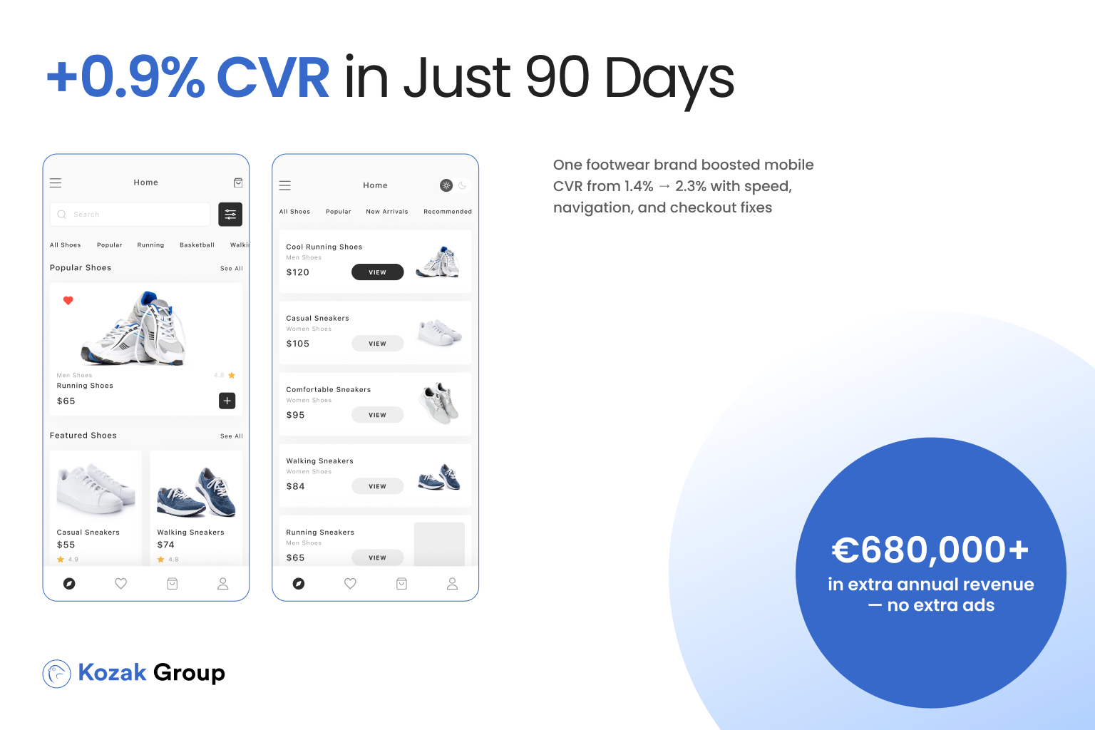
To see how impactful mobile UX improvements can be, let’s look at a real-world style scenario. Consider Liora, a mid-sized European fashion brand specializing in women’s footwear and accessories. The company generated strong traffic – around 120,000 visits per month, 75% of which came from mobile channels (mainly Instagram Ads and TikTok campaigns).
Yet despite this healthy top of funnel, conversions told a different story.
- Desktop CVR: 3.1%
- Mobile CVR: 1.4%
- Annual revenue loss from the gap: ~€1.1M
The CEO and eCommerce Manager knew something was wrong: their ad budgets were climbing, but revenue wasn’t. They engaged a CRO audit focused solely on the mobile journey.
Key Findings
- Product pages loaded in 5.8 seconds on 4G connections, leading to drop-offs.
- Navigation buried size filters three clicks deep, making product discovery frustrating.
- Checkout required 14 fields before completion, with no guest checkout or wallet options.
- Return and shipping policies were hidden in a bottom-page link, creating uncertainty.
Implemented Fixes
- Speed optimization: Compressed imagery, enabled lazy loading, deployed a CDN. Load time dropped to 2.4 seconds.
- Navigation revamp: Visible filter buttons and simplified menus reduced bounce rates on category pages.
- Checkout streamlining: Fields cut by 40%, Apple Pay and Klarna integrated.
- Info visibility: Delivery/returns added above the fold with a one-click size guide.
- Visuals upgraded: Swipeable galleries, zoom, and 15-second try-on videos.
Results in 90 Days
- Mobile CVR rose from 1.4% → 2.3% (+0.9%)
- Monthly mobile orders increased by 810
- Revenue uplift: €56,700/month (~€680,000 annually)
- ROAS improved by 27%, since ad spend remained constant.
For Liora, the improvements weren’t radical redesigns – they were targeted, data-backed fixes. The revenue gains equaled the output of an entire new sales channel, achieved without raising budgets.
This case underlines a critical point: even small UX adjustments can close the mobile-desktop gap and unlock six or seven figures in additional revenue.
Read more about this in our previous article:
More Traffic Isn’t the Answer – Better Conversions Are
Closing the Gap is the Fastest Route to Growth

For fashion eCommerce managers, the mobile-desktop conversion gap is not just a technical detail – it’s a direct revenue leak. Every day your site underperforms on mobile, you’re leaving orders, customers, and profit on the table. And as mobile traffic dominates discovery and shopping behaviors, this gap is no longer optional to ignore.
The numbers speak for themselves:
- Mobile makes up 70-80% of traffic for most fashion brands in Europe.
- The average mobile CVR is still 40-60% lower than desktop.
- Closing just half of that gap can mean hundreds of new monthly orders without increasing ad spend.
Think about the implications. For a brand with 10,000+ monthly visitors, even a modest 0.5-1% lift in CVR translates to tens of thousands of euros in additional monthly revenue. And unlike scaling ad campaigns, which quickly inflate customer acquisition costs, UX-driven gains are sustainable and compounding over time.
The best part? Closing the gap doesn’t require a complete replatforming or massive budget. It’s about identifying the biggest friction points – slow speeds, poor navigation, clunky checkouts, hidden product info – and fixing them with precision. As the Liora case showed, the payoff can be six or seven figures annually.
Your Next Step
If your brand is struggling with the mobile-desktop conversion gap, the smartest move is to start with a CRO audit of your mobile journey. In just a few weeks, you can get a data-backed assessment of what’s costing you sales and a prioritized roadmap to fix it.
At Kozak Group, we’ve helped fashion brands across Europe boost their mobile conversions by tackling exactly these issues. Our audits and experiments consistently unlock +0.5-1% CVR improvements – results that can mean the difference between stagnant growth and a record-breaking year.
The opportunity is already in your traffic. Don’t spend more on ads until your mobile site is converting at its full potential.
Book a CRO audit today, and let’s turn your mobile visitors into loyal, paying customers.


 AI Dealbot
