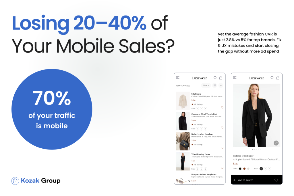

In auto parts eCommerce, your customers aren’t just looking for the cheapest price – they’re looking for certainty. Will this part fit my vehicle? Can I trust this store? What happens if I order the wrong item? These questions live beneath every click, every scroll, and every abandoned cart.
And in mobile-first shopping environments, where attention spans are short and decisions are made quickly, the stakes are even higher.
Unlike fashion or electronics, auto parts buyers tend to be more skeptical – and for good reason:
- A wrong part means wasted time, money, and repairs.
- The industry has its fair share of shady sellers and confusing listings.
- Return processes can be complex, costly, or unclear.
So if your website doesn’t actively build trust at every stage of the customer journey, you’re silently leaking conversions – especially on mobile, where UX friction is amplified.
In fact, research shows that over 70% of online buyers abandon their carts due to trust-related concerns, including unclear return policies, lack of product confidence, and fear of getting the wrong item. That’s not just lost revenue – that’s lost confidence.
But here’s the good news: trust can be designed. Through small but strategic UX improvements – often called micro-UX – you can earn the buyer’s confidence, reduce friction, and re-engage lost opportunities.
In this article, we’ll break down:
- The 5 key trust-killers in auto parts eCommerce
- Real-world examples of micro-UX improvements
- Practical tactics to recover abandoned carts and prevent future drop-offs
If you’re looking to turn more browsers into buyers – and more one-time shoppers into loyal customers – it’s time to stop guessing and start designing for trust.
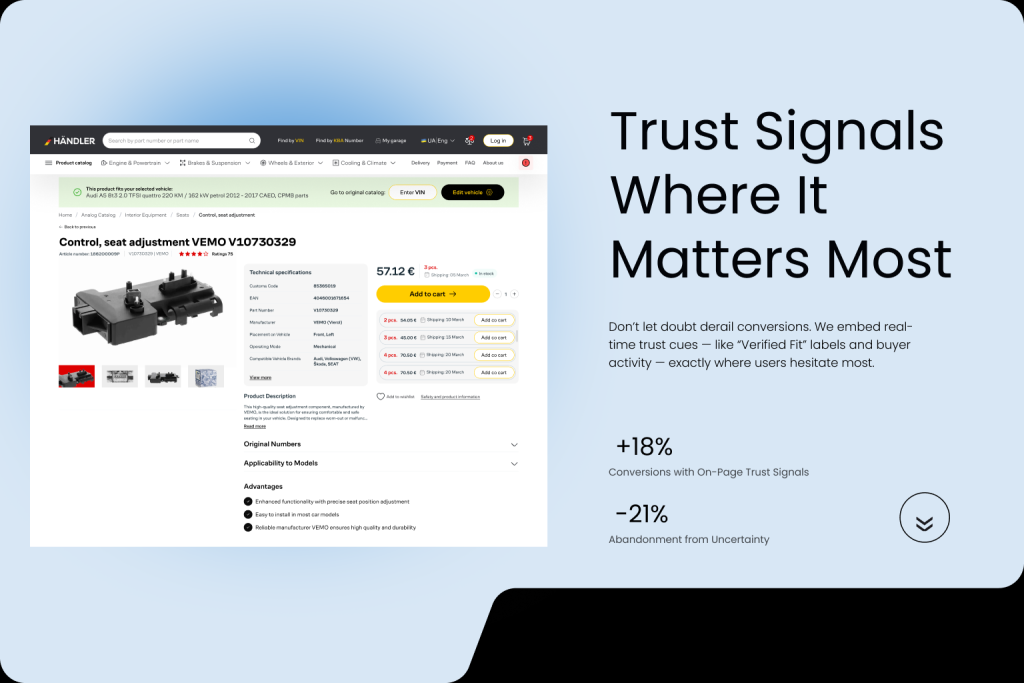
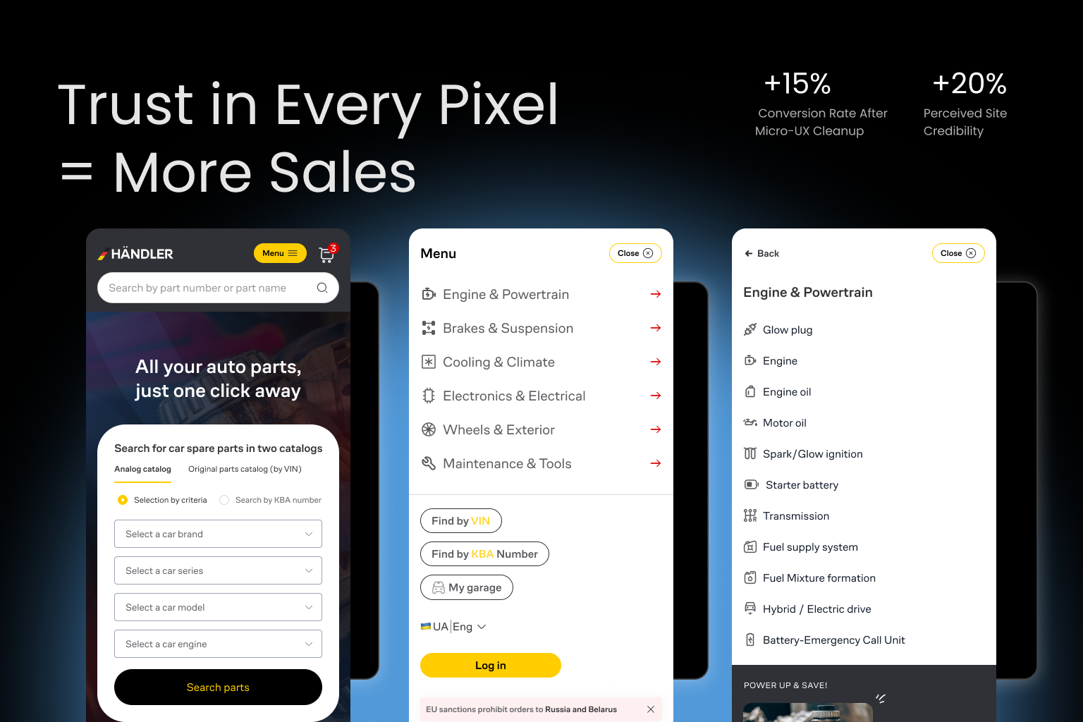
Problem #1: No Trust Signals at the Right Moments
Imagine you’re ready to spend $250 on a timing belt kit. You’ve selected your vehicle, scrolled through the product details, and you’re just about to tap “Add to Cart.” But then… uncertainty creeps in.
Is this website legit?
What if it doesn’t fit?
Can I return it?
Why doesn’t anyone seem to recommend it?
These silent questions are conversion killers, especially when your site lacks trust signals – visual, textual, or structural elements that assure users they’re making a smart, safe, and risk-free decision.
Read in our previous article:
Top Strategies to Improve UX for eCommerce: Drive Sales and Customer Satisfaction
The absence of these signals doesn’t just create hesitation – it creates doubt. And in eCommerce, doubt = abandonment.
Where Most Auto Parts Sites Go Wrong:
- Trust badges (e.g., secure checkout, money-back guarantee) are buried in the footer or missing entirely.
- No visible customer reviews or testimonials on product pages.
- No confirmation that the part will fit the selected vehicle.
- No social proof (e.g., “1,500 mechanics bought this last month”).
- No clarity on shipping speed, return policy, or support.
On mobile, these omissions are even more damaging – because users scan quickly, and trust needs to be earned within seconds.
How to Fix It: Inject Trust Where It Matters Most
Here’s how to apply micro-UX and visual trust cues in key areas of the buying journey:
- Near the Buy Button:
- Add a “✔️ Verified Fit for Your Vehicle” label.
- Show real-time purchase data: “12 sold today.”
- Display return and warranty icons (e.g., “30-Day Free Returns”).
- Add a “✔️ Verified Fit for Your Vehicle” label.
- In the Cart:
- Include trust badges like “Secure Checkout” and “SSL Protected”
- Highlight shipping transparency (“Delivered in 2–3 business days”).
- Include trust badges like “Secure Checkout” and “SSL Protected”
- On Product Pages:
- Showcase user reviews prominently, including star ratings and comments about fitment.
- Use microcopy that reassures: “Not sure? Don’t worry – returns are hassle-free.”
- Showcase user reviews prominently, including star ratings and comments about fitment.
- Sticky Trust Elements:
- Use a floating badge or sticky footer with short reassurance copy like “Trusted by 100,000+ car owners”.
- Use a floating badge or sticky footer with short reassurance copy like “Trusted by 100,000+ car owners”.
Result:
Sites that strategically place trust cues near points of action (CTAs, checkout, cart) often see conversion lifts of 15–25%, especially on mobile. It’s not just what you sell – it’s how confident people feel while buying it.
Problem #2: Unclear Return and Fitment Policies
In auto parts eCommerce, trust hinges on one critical question: “Will this part fit my vehicle?”
If your site doesn’t answer that question with clarity and confidence – or doesn’t clearly explain what happens if it doesn’t – you’re inviting abandonment.
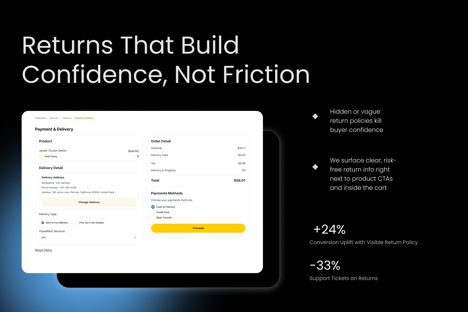
Many auto parts stores bury return policies deep in footers, use vague language like “some items may not be eligible,” or worse – provide no fitment guarantee at all. The result? Uncertainty. And uncertainty kills conversions.
A buyer might hesitate not because they don’t want the product, but because they’re afraid of what happens if they make the wrong choice.
Common UX Failures:
- Return policies hidden in legalese, PDF downloads, or FAQ pages
- No fitment guarantee or “will this fit?” too
- Confusing eligibility rules (e.g., only unopened items, no electrical parts)
- No indication of who pays return shipping
- Zero visibility of policies during the cart or checkout process
This creates a high-friction, high-risk experience – especially for first-time buyers.
How to Fix It: Make Fitment & Returns Friction-Free and Visible
Here’s how to resolve doubts before they derail the conversion:
Show Fitment Confidence
- Add a “Guaranteed to Fit” badge on product pages when a user selects or inputs their vehicle.
- Enable a license plate or VIN lookup tool for instant vehicle detection.
- Use conditional microcopy like:
“Yes, this part fits your 2015 Honda CR-V LX 2.4L.”
Simplify and Surface Your Return Policy
- Include return policy highlights near the Add to Cart button:
“Free 30-Day Returns. No restocking fees.” - Use tooltips or expandable micro-panels for quick-view returns info on mobile.
- Mention the return process again during checkout, not just after purchase.
Add Reassurance in the Cart
Reinforce return & fitment policies inside the cart summary:
“100% Fitment Guarantee – Return it free if it doesn’t fit.”
Result:
Stores that clearly communicate return and fitment policies upfront see up to a 30% reduction in cart abandonment and significant decreases in customer support tickets related to compatibility questions.
Transparency isn’t just good UX – it’s a conversion strategy.
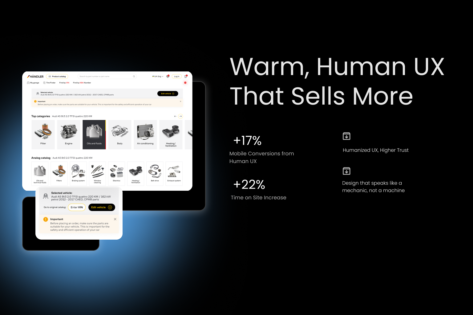
Problem #3: Cold, Transactional UX (No Human Feel)
Your website might be functional. It might even be fast. But if it feels like a cold, robotic transaction system, it will fail to build trust – especially in the auto parts niche, where many shoppers are unfamiliar with part names, compatibility rules, or repair terms.
Think about it:
Your users may be stressed – their car broke down.
They may not be auto-savvy – they just Googled “alternator for 2014 Ford Escape.”
They may not even be sure if they’re buying the right thing.
In this state of mind, a sterile interface that treats them like a machine – offering no guidance, no personality, and no sense of care – drives hesitation and abandonment.
This is where emotional design and human micro-UX come into play. The goal? Make users feel like there’s a real person behind the site, ready to help.
Common Signs of “Cold UX”:
- Bland, robotic product copy (“SKU #348732 – 12V Alternator”)
- No personalization or conversational language
- Absence of any human imagery or helpful content
- No live chat, or one that feels scripted and soulless
- No empathy in error messages (“Invalid input” instead of “Hmm, looks like that VIN didn’t work – want help?”)
How to Fix It: Add Human Touches Throughout the Journey
Use Friendly, Reassuring Microcopy
- Replace cold CTAs like “Submit Order” with “Place My Order Now”
- Use first-person tone: “Need help? We’re here for you.”
Add Personalization
- Greet returning users: “Welcome back, Alex.”
- Remember vehicle selections and show parts for “your 2017 Jeep Wrangler.”
Humanize the Interface
- Add a “Trusted by Real Mechanics” section with faces and names.
- Include quick advice sections: “Mechanic’s Tip: Always replace belts in pairs.”
- Use conversational tone in the empty cart state:
“Your cart is feeling lonely. Let’s find the right part.”
Improve Chat Support UX
- Add agent photos and names (real or branded)
- Use live chat triggers like: “Need help choosing the right part? We’re online now.”
Result:
Adding human warmth to UX increases emotional trust, which can boost mobile conversions by 10–25%, lower bounce rates, and increase average time on site. One parts retailer saw a 17% uplift in customer support engagement after switching to conversational UI across their site.
Micro-humanization leads to macro-impact.
Problem #4: No Recovery Flow for Abandoned Carts
Every eCommerce store loses sales. But not every store recovers them.
In auto parts eCommerce, cart abandonment is especially common – and costly. A buyer might add the correct alternator or brake pads, get distracted, question the fitment, or simply hesitate. If there’s no recovery system in place, that shopper (and their money) is gone for good.
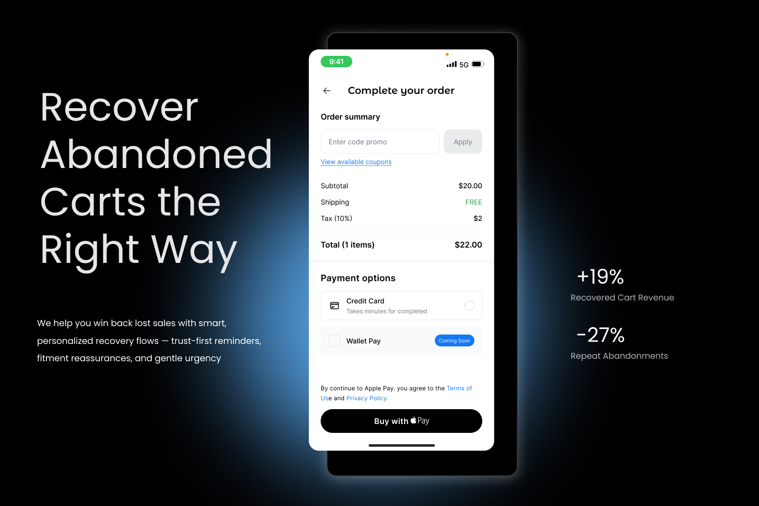
Industry-wide, average cart abandonment rates sit around 70% – and for mobile users, it can climb even higher. But here’s the opportunity: with the right abandonment recovery strategy, you can win back a meaningful percentage of those lost conversions.
Unfortunately, many auto parts stores:
- Don’t send follow-up emails
- Don’t trigger retargeting ads
- Don’t offer reminders, reassurance, or incentives
- Don’t track cart activity at all
That’s not just a missed opportunity – that’s a compounding loss.
Where Recovery Fails in Auto Parts UX:
- No email capture before cart step = no remarketing possible
- No abandoned cart emails or SMS reminders
- Retargeting ads show generic branding, not the exact product
- Follow-ups lack value – no trust reinforcement or guarantees
- No urgency or emotional reason to return
How to Fix It: Create a Smart, Trust-Centric Recovery Flow
Step 1: Capture Email Early (but Gently)
- Offer guest checkout with an optional “Send cart to email” button
- Use microcopy like: “Want to save this cart for later?”
Step 2: Send a 3-Step Abandoned Cart Email Sequence
- Reminder (1-2 hours later):
“Still thinking it over? This part is still reserved for your [Vehicle Model].” - Reassurance (24 hours later):
“It’s a match. Our experts guarantee this fits your 2013 Subaru Outback – or your money back.” - Urgency/Incentive (48-72 hours later):
“Last chance: Your cart expires soon. Here’s 5% off to complete your order.”
Step 3: Retarget with Personalized Ads
- Show the exact product the user viewed + a trust statement
“Perfect fit for your 2017 Ram 1500. Free returns if it doesn’t fit.”
Step 4: Use Exit-Intent Popups
- If user moves to close tab:
“Leaving already? Save your cart and get free return assurance.”
Result:
Implementing a basic cart recovery flow with personalization and trust-based messaging can recover 10–20% of lost carts. That’s not just revenue reclaimed – it’s confidence restored.
Problem #5: Inconsistent or Low-Trust Micro-UX Details
You might think users abandon because of big issues – slow site, bad product info, high prices. But often, it’s the small things that quietly destroy trust and derail conversions.
These “micro-UX” details – icons, animations, loading states, button styles, text consistency – may seem minor, but they signal credibility, stability, and attention to detail. Or the lack thereof.
In the auto parts niche, where users often don’t know much about the products, they rely heavily on visual cues and micro-interactions to judge whether your store is trustworthy.
Here’s the hard truth:
Even if your prices are great and your parts fit, users will still hesitate to buy if the experience feels broken, outdated, or messy.
Trust-Killing Micro-UX Issues:
- Inconsistent button styles (e.g., “Buy Now” vs. “Add to Cart” vs. “Order”
- Outdated or pixelated icon
- Spinning loaders that never finish (or have no feedback at all)
- Missing or unclear field validation in forms
- Hover effects that don’t work on mobile
- Conflicting colors or hard-to-read text
- Out-of-sync spacing or visual glitches on product cards
These issues signal: “This site isn’t professional.”
And if your UX looks sloppy, customers may assume your parts and service are too.
How to Fix It: Sweat the Small Stuff
Standardize Visual Language
- Use a consistent color scheme, button style, and font hierarchy across all pages.
- Audit iconography – upgrade to clean, modern, recognizable icons.
- Align all interactive elements visually and spatially.
Improve Micro-Interactions
- Add responsive feedback to all CTAs (pressed state, success message).
- Use short animations to signal page loads, add-to-cart actions, or saved filters.
- Display loading skeletons instead of blank white spaces.
Review Mobile Responsiveness in Detail
- Test all tooltips, tabs, sliders, and overlays on multiple screen sizes.
- Ensure spacing and tap targets are optimized for touch.
Result:
Sites that clean up micro-UX inconsistencies often report higher perceived trust, longer time on site, and increased conversion rates (by 8–15%) – without changing a single product or price. In auto parts eCommerce, polish = professionalism = profit.
Trust Is Built in the Details – and So Are Conversions
In auto parts eCommerce, trust is not a “nice to have” – it’s the foundation of every sale.
Your customers aren’t just shopping for parts; they’re looking for confidence. Confidence that the part will fit. That they won’t be scammed. That if something goes wrong, they won’t be stuck with the wrong alternator and a $15 return shipping label.
And that trust is built (or lost) through micro-moments – the tiny interactions, messages, and design decisions that shape how your store feels.
Read in our previous article:
5 UX Mistakes That Kill Mobile Sales in Auto Parts eCommerce (and How to Fix Them)
Let’s recap the five trust-killers that silently damage your conversions:
- Missing Trust Signals – No visual assurance during key buying moments.
- Unclear Fitment & Return Policies – Doubt creeps in when things are hidden or complicated.
- Cold, Robotic UX – Users feel like they’re dealing with a machine, not a team
- No Recovery Strategy – Abandoned carts vanish without a second chance.
- Inconsistent Micro-UX – Visual glitches and sloppy details erode professionalism.
The fix? Design for trust – on purpose.
That means placing reassurance messages near CTAs, simplifying returns, humanizing your tone, polishing every interaction, and recovering lost users with empathy and value.
Even small improvements in trust signals can lead to:
- 10–25% higher mobile conversion rates
- 20–30% fewer cart abandonments
- Increased repeat purchases and brand loyalty
Because when customers trust your site, they don’t just buy once – they come back. They recommend you. They remember you.
In a space as competitive and high-stakes as auto parts, that’s how you win.