

Why UX Can Make or Break Mobile Sales in Auto Parts eCommerce
In the fast-paced world of auto parts eCommerce, mobile isn’t just “part of the mix” anymore – it’s the main battlefield. According to Statista, more than 60% of global eCommerce traffic now comes from mobile devices. And in verticals like auto parts, where purchases are often urgent and specific (think: “I need brake pads today!”), a seamless mobile experience is critical.
But here’s the problem: most auto parts stores aren’t built for mobile behavior.
Instead of helping users quickly find, verify, and purchase the exact part they need, many websites present:
- Outdated navigation
- Confusing product fitment info
- Slow load times
- Multi-step checkouts
- And weak search tools that assume the user is “just browsing”
This creates frustration – and frustration leads to abandoned carts, dropped sessions, and ultimately lost revenue.
In this article, we’ll break down the 5 most damaging UX mistakes we see in mobile auto parts stores – and provide practical, battle-tested solutions to fix them.
Whether you’re a store owner, UX designer, or growth marketer, this guide will help you turn your mobile experience into a competitive advantage.
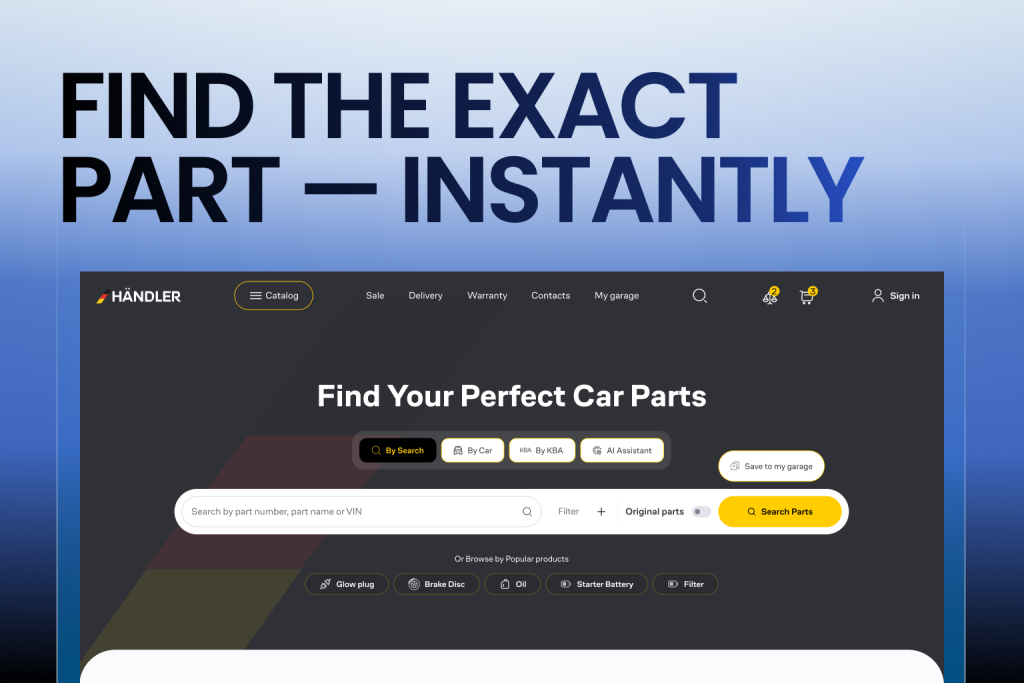
Mistake #1: Poor Search Experience for Specific Parts
When it comes to buying auto parts, users typically aren’t “just browsing” – they’re on a mission. They know what they need, or at least what vehicle they’re buying for. This makes search functionality one of the most critical elements of UX in auto parts eCommerce. And yet, it’s also one of the most overlooked.
A typical auto parts buyer isn’t searching for “cool car accessories” or “best-selling parts.” They’re typing in things like:
- “Front brake pads for 2018 Toyota Camry”
- “Oil filter 2.5L Ford Escape 2016”
- “NGK spark plug BKR5E-11”
When the on-site search engine returns irrelevant or overly generic results, the user immediately loses confidence. If it takes more than a few seconds to find the right fitment, most will abandon the session and head to a competitor.
Worse, some sites don’t even offer filtering by vehicle make, model, and year — forcing users to scroll endlessly through dozens or hundreds of products. This is especially frustrating on mobile, where screen space and attention spans are limited.
How to Fix It: Turn Search Into a Smart Fitment Engine
To deliver a world-class mobile search experience in auto parts eCommerce, consider the following UX and tech upgrades:
- Smart Autocomplete: As users begin typing, offer dynamic suggestions based on popular searches, part numbers, vehicle types, and previous search data.
- Year/Make/Model Selector (YMM): Implement a dropdown or guided selection process that allows users to input their vehicle once and browse only compatible parts.
- Sticky Search Bar: On mobile, keep the search bar visible as users scroll, so they can refine or restart their query without hunting for the top of the page.
- VIN or License Plate Lookup: Advanced stores integrate third-party APIs that allow users to enter a license plate or VIN (Vehicle Identification Number), instantly returning a list of matching parts.
- Fitment Confirmation: Show a bold, visual confirmation (like a green checkmark and the message “✅ Fits your 2018 Ford F-150”) on the product page and cart.
Business Impact:
Sites that implement smart search and filtering can reduce bounce rates by up to 40%, increase average session duration, and improve mobile conversion rates significantly. More importantly, they create trust – the most valuable currency in online auto parts sales.
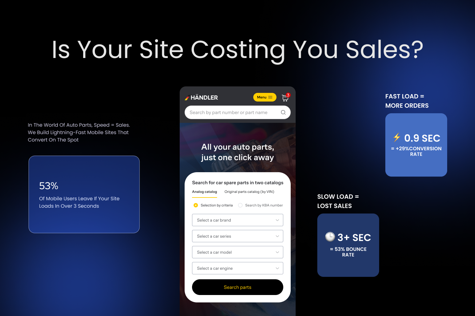
Mistake #2: Slow Load Times on Mobile
In the auto parts eCommerce game, speed isn’t just important – it’s everything. A mobile user landing on your site is often in a hurry: their vehicle may be broken, a repair appointment is pending, or they’re making a purchase during a lunch break or while standing in a garage. If your site takes longer than 3 seconds to load, nearly 53% of users will abandon it – and you’ll likely never see them again.
Auto parts websites are particularly prone to performance issues due to:
- Large product catalogs with high-resolution images
- Heavy reliance on JavaScript-based plugins
- Overloaded themes or outdated CMS frameworks
- Unoptimized mobile assets (e.g., uncompressed images, render-blocking resources)
And mobile users often access these sites via slower networks, especially in garages or on the go – amplifying every millisecond of lag.
What Slow Load Times Really Do:
- Kill first impressions: If your site feels “heavy,” it undermines trust right away.
- Increase bounce rate: Visitors leave before engaging.
- Lower SEO rankings: Google prioritizes fast-loading pages, especially on mobile.\
- Reduce conversion rates: A 1-second delay can lead to a 7% drop in conversions, according to Akamai.
How to Fix It: Build for Mobile Speed First
Fixing mobile speed is both a technical and a strategic challenge, but the payoff is huge. Here’s where to start:
- Use Performance Auditing Tools: Google PageSpeed Insights, GTmetrix, and Lighthouse can give you detailed speed diagnostics.
- Compress and Lazy Load Images: Auto parts often require large images — but those images should load only when needed and in the smallest size required for the device screen.
- Implement Caching & CDN: Use a content delivery network (CDN) like Cloudflare to serve content from locations close to your users, and enable browser caching to speed up return visits.
- Minify and Defer JS/CSS: Minimize JavaScript and CSS files, and defer non-essential scripts to prevent blocking the rendering of visible content.
- Adopt a Progressive Web App (PWA): PWAs provide an app-like experience with instant loading, offline functionality, and smoother UX for mobile users.
Business Impact:
One auto parts merchant we worked with saw a 38% increase in mobile conversion rate after optimizing their mobile speed. Their bounce rate dropped by 26%, and their Google Core Web Vitals scores moved from “poor” to “good,” improving both organic traffic and paid ad performance.
Speed isn’t optional. It’s a foundational part of your brand experience – especially in a category where urgency often drives the purchase.
Read more in our previous article:
Top 10 User Experience Enhancement Tactics for 2025
Mistake #3: Complex Mobile Checkout Process
You’ve done the hard part: a customer found the exact auto part they need on your site. But now comes the most fragile moment of the entire customer journey – the checkout process. Unfortunately, for many mobile users, this is where things fall apart.
Auto parts eCommerce sites often suffer from overly complex, desktop-first checkout flows that simply don’t translate to mobile. From multiple screens to non-optimized input fields, from hidden shipping costs to mandatory account creation, these friction points can significantly damage your sales.
According to the Baymard Institute, 17% of users abandon their cart because the checkout process is too long or complicated. On mobile, where typing is harder, screens are smaller, and distractions are higher, this percentage is likely even greater.
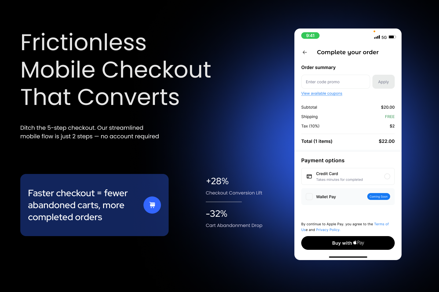
The Biggest UX Issues in Mobile Checkout:
- Too many form fields requiring address, email, phone, and vehicle details
- No guest checkout – forcing users to register just to complete a transaction
- Multiple steps/screens without clear indicators of progress
- No mobile wallet integration (Apple Pay, Google Pay, etc.)
- Lack of error feedback or auto-fill suggestions
These issues don’t just cause frustration – they make users question your site’s professionalism and reliability. That’s fatal in a trust-sensitive industry like auto parts, where the wrong order can cost customers time and money.
How to Fix It: Make Checkout Effortless on Mobile
Here’s how to turn your checkout from a conversion killer into a profit machine:
- Enable Guest Checkout: Let customers purchase without creating an account. Offer the option to create one afterward – not before.
- Use Mobile Wallets: Apple Pay, Google Pay, and PayPal One Touch dramatically reduce friction for returning customers.
- Implement Address Autofill: Use browser autofill or integrate with APIs like Google Places to speed up address entry
- Minimize Steps: Ideally, your mobile checkout should be no more than 2 screens. Combine steps where possible (e.g., billing and shipping).
- Display Total Cost Upfront: No one wants a surprise $25 shipping charge at the last step.
- Add Progress Indicators: Let users know where they are in the process and how close they are to completion
- Make CTA Buttons Sticky and Clear: “Continue,” “Next,” and “Place Order” buttons should always be visible and easily tappable.
Business Impact:
A streamlined mobile checkout experience can boost conversion rates by 20–35%, especially among returning users. It also reduces cart abandonment, increases customer satisfaction, and shortens time-to-purchase – which is crucial for parts often needed urgently.
Remember: Every extra tap is a potential exit point. Your goal? Frictionless flow from cart to confirmation.
Mistake #4: Inconsistent or Confusing Part Descriptions
Imagine this: a customer finds a brake rotor that might fit their 2016 Honda Accord. But the description is vague. There’s no mention of compatible models, no OEM number, and the image is blurry or generic. What happens next? They leave.
In the auto parts world, buyers aren’t just shopping – they’re solving a problem. They need to know, with absolute certainty, that the part they’re about to purchase will fit their specific vehicle. Any ambiguity in the product listing instantly creates doubt. And doubt is the enemy of conversions.
On mobile devices, where screen space is limited and users scroll quickly, poorly structured or incomplete product information becomes even more damaging.
Common UX Failures in Product Descriptions:
- Missing or unclear vehicle compatibility info
- No OEM or cross-reference numbers
- Lack of technical specifications (size, material, fitment location)
- Inconsistent formats across listings
- No customer reviews or user-generated images
- Low-quality or single-angle product photos
These issues not only impact conversion but also increase return rates, support tickets, and chargebacks due to incorrectly purchased items.
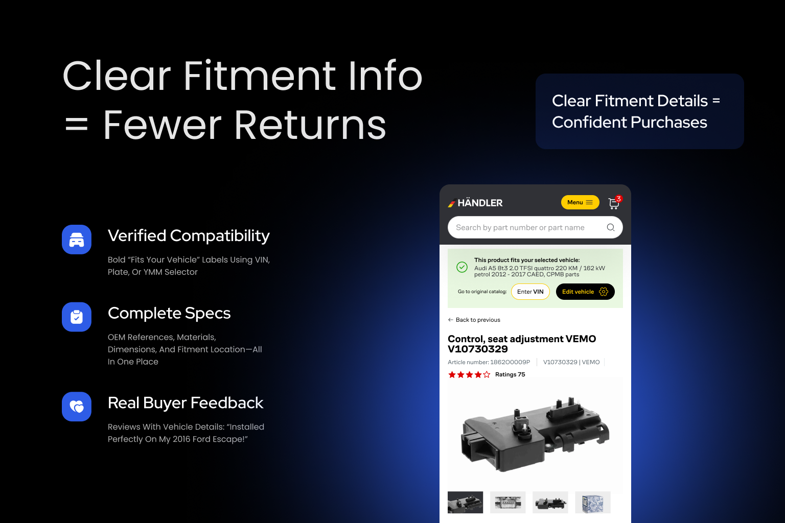
How to Fix It: Build Trust with Clear, Standardized Info
Here’s how to turn every product listing into a confident “Yes, this is what I need” moment:
- Standardize All Product Listings: Create templates that include:
- Compatible makes, models, years, and trims
- OEM and cross-reference part numbers
- Technical specs (dimensions, materials, installation notes)
- Clear, high-resolution images from multiple angle
- Warranty and return policy highlights
- Add a “Fits Your Vehicle” Badge: When a user selects their vehicle or enters a license plate/VIN, display a prominent fitment confirmation badge directly on the product page.
- Incorporate User Reviews with Fitment Confirmation: Allow verified buyers to tag their reviews with vehicle model and whether the part fit. This builds social proof and trust.
- Include Installation Guidance: Even a simple “installation difficulty” rating or short video tutorial can help users feel more confident.
Business Impact:
A well-structured product description can boost conversion rates by up to 40%, reduce product returns, and improve SEO. One auto parts retailer saw a drop in return-related customer support requests by 30% after standardizing product info and adding fitment badges.
Clarity is not optional – it’s part of the product.
Mistake #5: No Sticky Add-to-Cart or Buy Buttons
Let’s say a mobile visitor has scrolled through your product page. They’ve read the compatibility information, seen the high-res images, and decided – “This is the part I need.” Now what?
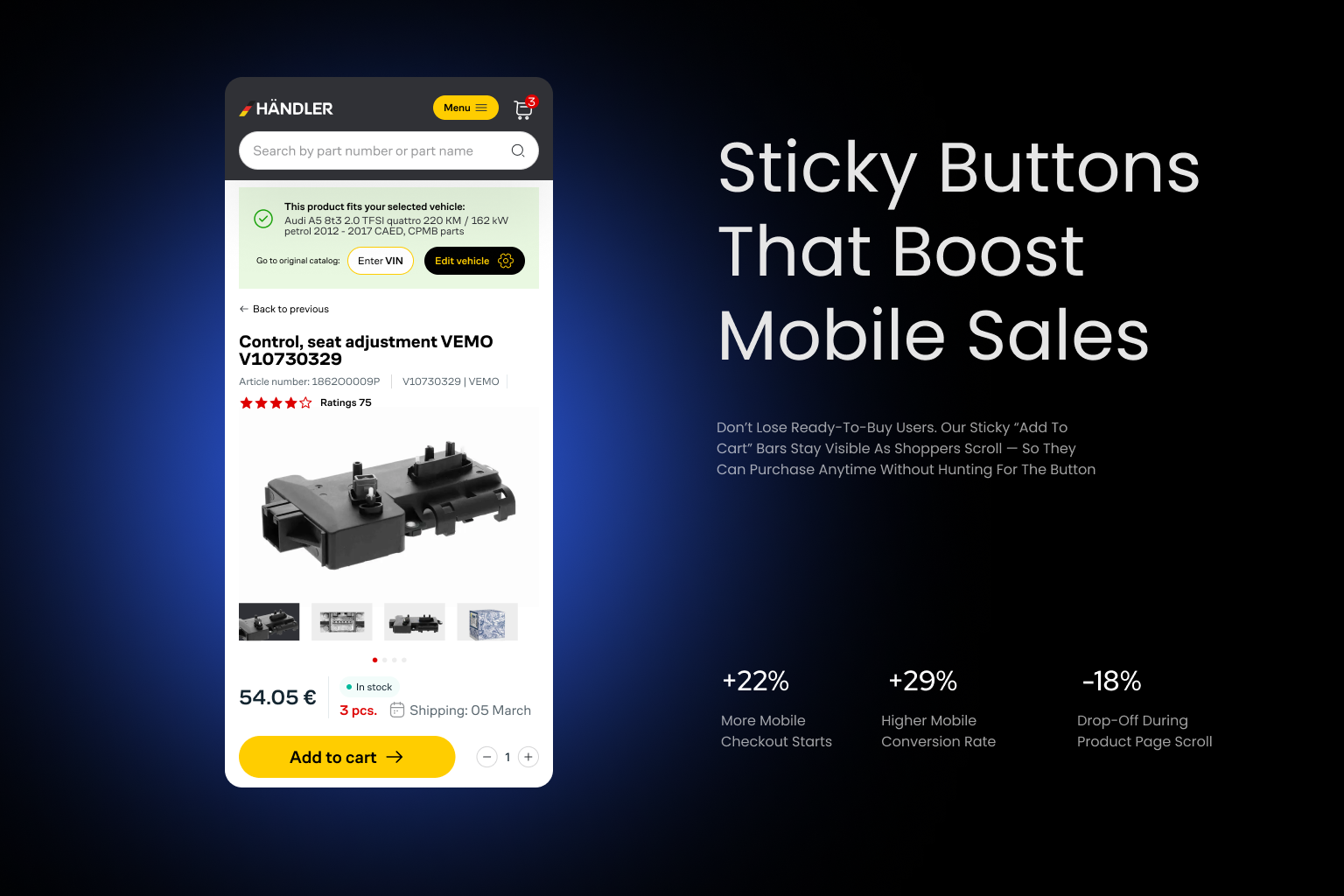
If your Add to Cart or Buy Now button isn’t immediately visible – especially on mobile – you risk losing that sale in an instant.
On small screens, users often scroll down to read reviews, specifications, shipping info, or return policies. But when they’re ready to buy, if the call-to-action (CTA) button is nowhere to be found, they must scroll back up or search for it. That small amount of friction can be the difference between a conversion and a bounce.
A study by Baymard Institute found that unclear or poorly placed CTA buttons contribute to up to 10% of abandoned sessions on mobile.
Common CTA-Related Mobile UX Mistakes:
- Add to Cart button placed only at the top
- No visual cue or animation when product is added to the cart
- Button hidden beneath long blocks of text or images
- Tiny, hard-to-tap buttons
- Lack of urgency indicators (“Only 3 left!” / “Ships today”)
These issues break the flow of intention. Users want to act – but your site makes it harder than it should be.
Read more in our previous article:
The Best Guide to SEO for E-commerce Success
How to Fix It: Keep CTAs Persistent, Clear, and Actionable
To boost mobile conversions, your primary CTAs should always be visible, interactive, and frictionless:
- Sticky CTA Bar: Add a sticky “Add to Cart” or “Buy Now” button that follows users as they scroll. This ensures they can act at any time without hunting for the button.
- Large, Thumb-Friendly Buttons: Ensure the button is easy to tap, even on smaller screens. Minimum recommended size is 48×48 pixels (per Google’s guidelines).
- Micro-animations or Confirmation Feedback: Provide visual feedback when the button is tapped – for example, a cart icon animation or toast message saying “Added to Cart”.
- Price Visibility: Keep the product price visible in the sticky bar to reinforce the purchase decision.
- Contextual CTAs: Use language that fits the mobile mindset, e.g., “Buy Now – Ships Today” or “Add to Cart – Only 2 Left”.
Business Impact:
One auto parts brand saw a 22% increase in mobile checkout starts just by introducing a sticky Add to Cart bar. Combined with urgency messaging and price visibility, their mobile conversions jumped by 29% within 60 days.
CTA visibility isn’t just good UX – it’s critical sales infrastructure.
Conclusion: Optimize UX, Maximize Mobile Revenue
The rise of mobile commerce isn’t coming – it’s already here. For auto parts eCommerce, mobile is no longer a secondary channel or a future opportunity. It’s the primary battlefield where users search, compare, and – if the experience is right – buy.
But the unfortunate reality is this: most online auto parts stores still treat their mobile experience as an afterthought. The result? Sluggish sites, confusing product info, broken search flows, and leaky checkouts that quietly kill conversions and drain revenue every single day.
Let’s recap the 5 most costly UX mistakes:
- Poor Search Experience – Users can’t find the exact part they need fast enough.
- Slow Load Times – Every second of delay costs you potential buyers.
- Complex Mobile Checkout – Friction-filled processes cause cart abandonment.
- Inconsistent Product Descriptions – Uncertainty leads to hesitation and lost trust.
- Missing Sticky CTA Buttons – Users can’t act when they’re ready to buy.
The good news? Each of these issues is fixable. And even small improvements can lead to dramatic business gains – from lower bounce rates and increased mobile conversions, to higher customer satisfaction and fewer returns.
Whether you’re an eCommerce manager, developer, or founder in the auto parts space, investing in better mobile UX isn’t just about “design” – it’s about unlocking growth.
A faster, clearer, and frictionless mobile experience turns first-time visitors into repeat customers – and turns your store into a trusted go-to resource in a competitive industry.


 AI Dealbot
