

Why Mobile UX Can Make or Break Your Fashion eCommerce Business
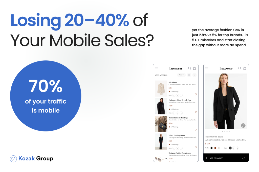
In 2024, mobile traffic isn’t just a big part of fashion eCommerce – it dominates it. Across Europe, 70% of paid traffic for fashion retailers comes from mobile devices (Dynamic Yield, 2024). Yet, despite this overwhelming shift, the average mobile conversion rate (CVR) in the fashion sector still hovers around 2.8%, while top-performing brands are hitting 5% or higher.
For CEOs and business owners, this gap between “average” and “top performer” is not just a number – it’s a direct reflection of lost revenue. If your store gets 10,000 visitors per month, and 70% of them are on mobile, moving your CVR from 2.8% to 3.5% could easily mean dozens – if not hundreds – of additional orders each month without spending a single extra euro on ads.
And here’s the catch: most brands don’t have a traffic problem – they have a post-click problem. Your ads might be generating the clicks, but if your mobile user experience (UX) is slow, confusing, or inconvenient, those visitors will leave before they ever reach checkout.
The data is brutal:
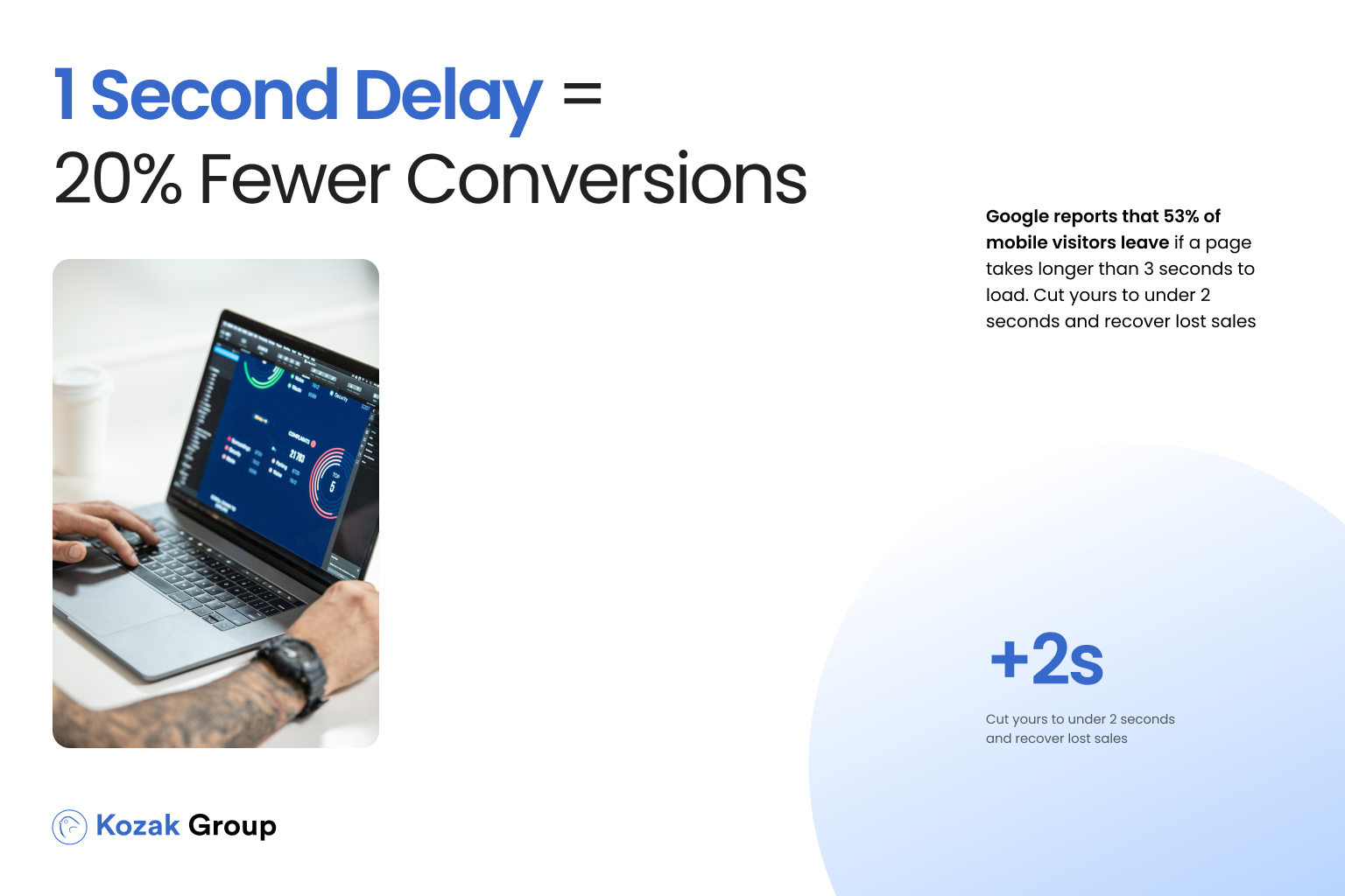
- Shopify Plus reports that a 1-second delay in mobile load time can reduce conversions by up to 20%.
- Google research shows that 53% of mobile users abandon a site if it takes longer than 3 seconds to load.
- According to Hotjar, sticky calls-to-action (CTAs) on mobile can increase add-to-cart rates by up to 8-12% in eCommerce.
Think about the implications: you could be running your best-ever campaign on Meta or Google Shopping, generating high click-through rates (CTR), but losing the majority of those potential customers due to friction points they encounter on your mobile site. Every extra second of load time, every hidden size guide, and every unnecessary checkout step is a silent revenue killer.
In this article, we’ll break down five of the most common mobile UX mistakes we see in fashion eCommerce stores and give you practical, data-backed solutions for fixing them. Whether you’re selling premium apparel, footwear, or accessories, these changes can help you:
- Reduce your cost per acquisition (CPA) by 15–25%
- Improve mobile CVR by 0.5–1.0 percentage points in 30 days
- Increase return on ad spend (ROAS) without raising ad budgets
If you’re spending €5,000–€20,000/month on ads, the ROI of fixing these UX mistakes is immediate – and measurable. Let’s dive in.
Mistake #1: Slow Page Load Times
Why This Is a Problem
Speed isn’t just a technical metric – it’s a core driver of user behavior and revenue in fashion eCommerce. When mobile users click an ad, they expect to see your product within seconds. If they don’t, they leave. And in fashion, where purchases are often driven by impulse and emotion, even a small delay can be the difference between a sale and a lost customer.
Industry research is clear:
- Google reports that 53% of mobile visitors abandon a site if it takes longer than 3 seconds to load.
- Shopify Plus data shows that just 1 extra second of page load time can lower conversion rates by up to 20%.
- Akamai found that a 100-millisecond delay in load time can decrease conversion rates by 7%.
For a store spending €10,000 a month on ads, losing even 10% of potential buyers to slow load times could mean thousands in wasted ad spend.
The Impact on Fashion eCommerce
Unlike some industries, fashion relies heavily on high-quality visuals. Large, unoptimized product images, videos, or interactive lookbooks can significantly slow down page load times – especially on mobile devices with weaker connections.
Here’s a common scenario we’ve seen in CRO audits:
- A customer clicks on a Facebook ad for a new dress collection.
- The PDP (product detail page) takes 4.5 seconds to fully load because of multiple 3MB images and non-optimized scripts.
- By the time the content is visible, the user’s attention has shifted – they close the tab and move on.
This isn’t just lost revenue; it also hurts your advertising efficiency. Meta’s and Google’s algorithms factor in post-click engagement when optimizing ads. If users bounce quickly, your cost per click (CPC) can increase over time.
How to Fix It
- Optimize Images
- Use modern formats like WebP or AVIF.
- Implement responsive image sizes (srcset) so mobile devices don’t load desktop-sized files.
- Compress images without losing visual quality (tools: TinyPNG, Squoosh).
- Use modern formats like WebP or AVIF.
- Implement Lazy Loading
- Load product images only when they’re about to be visible on screen.
- Load product images only when they’re about to be visible on screen.
- Use a Content Delivery Network (CDN)
- Services like Cloudflare or Fastly can serve your content from servers closer to your customers, reducing latency.
- Services like Cloudflare or Fastly can serve your content from servers closer to your customers, reducing latency.
- Minimize and Defer Scripts
- Remove unused JavaScript and CSS.
- Defer non-essential scripts so they load after the main content.
- Remove unused JavaScript and CSS.
- Leverage Browser Caching
- Store static assets locally on the user’s device so repeat visits load instantly.
- Store static assets locally on the user’s device so repeat visits load instantly.
In fashion eCommerce, speed equals revenue. By improving your mobile load time from 4 seconds to under 2 seconds, you can see a measurable lift in conversions – often in the range of 12–20% – and get more value from every euro you spend on ads.
Mistake #2: CTA Not Visible Without Scrolling
Why This Is a Problem
Your call-to-action (CTA) – most often the “Add to Cart” or “Buy Now” button – is the single most important interactive element on your product detail page (PDP). On mobile devices, screen space is limited, and if your CTA isn’t visible immediately when the page loads, you’re introducing unnecessary friction.
According to Hotjar’s UX research, 64% of mobile users abandon PDPs without interacting with the CTA if it’s hidden below the fold. That’s not because they don’t want to buy – it’s because you’re asking them to scroll and search for the next step, and every extra action increases the drop-off rate.
On desktop, users can often see the product image, price, and “Add to Cart” button together. On mobile, however, many fashion eCommerce stores prioritize large hero images or banners that push the CTA far down the page.
The Impact on Fashion eCommerce
Fashion shoppers are often browsing multiple tabs or competitor sites at the same time. If they can’t see the purchase action right away, they may simply move on to a competitor whose site makes buying effortless.
Here’s a scenario we see frequently in CRO audits:
- A user clicks a Google Shopping ad for a pair of sneakers.
- The mobile PDP loads with a large full-screen product photo.
- The CTA is buried below several scrolls, after the description and size selector.
- The user gets distracted, switches tabs, and never completes the purchase.
Every second they spend searching for how to buy is a second closer to losing them.
How to Fix It
- Use a Sticky CTA on Mobile
- Keep the “Add to Cart” button visible at the bottom of the screen as the user scrolls.
- Keep the “Add to Cart” button visible at the bottom of the screen as the user scrolls.
- Rearrange Above-the-Fold Content
- Ensure the first screen includes product image, name, price, size selector, and CTA.
- Ensure the first screen includes product image, name, price, size selector, and CTA.
- Highlight CTA with Contrast and Size
- Follow accessibility guidelines (WCAG contrast ratio of at least 4.5:1).
- Make the button large enough for easy tapping on mobile.
- Follow accessibility guidelines (WCAG contrast ratio of at least 4.5:1).
- Test Different Variations
- A/B test CTA placement, color, and text to find the highest-converting combination.
- A/B test CTA placement, color, and text to find the highest-converting combination.
In mobile fashion eCommerce, your CTA must be immediately accessible. If a user has to hunt for it, you risk losing the sale. By implementing a sticky CTA and rethinking above-the-fold layout, brands often see a 5–15% increase in add-to-cart rates and a significant lift in mobile CVR within weeks.
Mistake #3: Hiding Critical Information (Size Guide, Return Policy)
Why This Is a Problem
Fashion purchases come with a natural level of uncertainty. Will the item fit? What if the color looks different in person? Is it easy to return? These questions are especially important in online shopping because customers can’t physically try the product. When crucial details like the size guide, return policy, and delivery information are buried far down the page or hidden behind small links, you increase hesitation-and hesitation kills conversions.
According to CXL Institute, 74% of shoppers expect the size guide to be easily accessible on the product page without scrolling or extra clicks. Similarly, Baymard Institute research shows that unclear return policies are a top reason customers abandon their purchase.
The Impact on Fashion eCommerce
Hiding critical details forces shoppers to either hunt for information or make assumptions. In both cases, you risk losing them. A hesitant shopper is unlikely to commit, especially when a competitor makes these details obvious.
Here’s a common scenario we’ve identified in audits:
- A shopper finds a dress they like via a Meta ad.
- They can’t find the size chart without scrolling through multiple images and text blocks.
- There’s no clear return policy on the PDP-only in the footer.
- Faced with uncertainty, the shopper leaves to “think about it” and never returns.
Fashion brands also risk increased return rates if customers purchase without understanding sizing or policies upfront.

How to Fix It
- Move Size Guide Above the Fold
- Place it near the size selector or under the price.
- Use a clear label and make it tappable without leaving the page.
- Place it near the size selector or under the price.
- Add Return & Delivery Info to the First Screen
- Use icons for “Free Returns,” “Fast Shipping,” and “Secure Payment.”
- Keep descriptions short and link to more details.
- Use icons for “Free Returns,” “Fast Shipping,” and “Secure Payment.”
- Highlight Trust Elements
- Customer reviews, guarantees, and security badges build confidence.
- Customer reviews, guarantees, and security badges build confidence.
- Test Placement
- A/B test positioning of these elements to find the combination with the highest CVR.
- A/B test positioning of these elements to find the combination with the highest CVR.
Transparency builds trust, and trust drives sales. By placing size guides, return policies, and delivery info in clear view on mobile PDPs, fashion brands often see a 0.6–1.2% lift in mobile CVR within 30 days-without any changes to ad spend.
Mistake #4: Complicated Mobile Checkout
Why This Is a Problem
Checkout is the final and most critical step in your sales funnel. It’s also the point where many fashion eCommerce stores lose their hard-earned customers. A complicated or poorly optimized mobile checkout experience can drastically increase cart abandonment, especially when shoppers are using small screens and limited input methods.
Industry research backs this up:
- Baymard Institute found that 17% of users abandon their cart because the checkout process is too long or complex.
- Nielsen Norman Group reports that 26% of mobile shoppers abandon purchases due to form usability issues-including small input fields, unclear steps, or excessive required information.
- In our own CRO audits, long checkout flows often correlate with a 15–25% higher cost per acquisition (CPA) compared to optimized flows.
On mobile, every extra tap or scroll increases the risk of losing the sale.
The Impact on Fashion eCommerce
Fashion purchases are often impulsive. Customers may be buying during a short break, on public transport, or while multitasking. If your checkout requires them to create an account, enter excessive details, or navigate through multiple screens, they may decide it’s not worth the effort.
Read in our previous article:
More Traffic Isn’t the Answer – Better Conversions Are
Here’s a scenario we see often:
- A customer adds a pair of shoes to the cart on their phone.
- They’re forced to create an account before proceeding.
- The checkout has five separate steps, each with multiple fields.
- Frustrated, the customer abandons the cart-possibly never to return.
Not only have you lost a sale, but you’ve also wasted the ad spend that brought them there.
How to Fix It
- Enable Guest Checkout
- Let users purchase without creating an account.
- Offer account creation after the sale.
- Let users purchase without creating an account.
- Streamline the Process
- Reduce checkout to two steps: Shipping Information → Payment Confirmation.
- Use progress indicators to show how close the customer is to completion.
- Reduce checkout to two steps: Shipping Information → Payment Confirmation.
- Optimize Form Fields for Mobile
- Larger input fields for touchscreens.
- Auto-fill for address and payment details.
- Larger input fields for touchscreens.
- Remove Non-Essential Fields
- Only ask for what’s absolutely necessary to complete the sale.
- Only ask for what’s absolutely necessary to complete the sale.
- Offer Multiple Payment Options
- Include mobile-friendly methods like Apple Pay, Google Pay, and PayPal.
- Include mobile-friendly methods like Apple Pay, Google Pay, and PayPal.
A smooth, quick checkout can turn a hesitant shopper into a paying customer. In our experience, optimizing mobile checkout flows can reduce abandonment rates by 15–25% and boost ROAS significantly-without spending a cent more on advertising.
Mistake #5: Poor Mobile Optimization for Content and Images
Why This Is a Problem
Fashion eCommerce is inherently visual. Your customers make purchasing decisions based largely on what they see. But if your product images and content aren’t optimized for mobile devices, you’re not only hurting the customer experience-you’re actively losing sales.

According to Google’s Retail UX Playbook, 83% of mobile users say that a seamless visual experience across devices is very important for brand loyalty. Poor mobile optimization-whether it’s oversized images causing slow loads, low-resolution photos that look pixelated, or text layouts that require zooming-signals a lack of attention to detail and reduces trust.
When customers can’t clearly see product details or must pinch and scroll to read descriptions, they are far more likely to abandon the page.
The Impact on Fashion eCommerce
The visual appeal of clothing, shoes, and accessories is directly tied to the quality of product presentation. In our CRO audits of European fashion brands:
- Stores with unoptimized mobile images had 15–20% lower conversion rates compared to competitors with fully responsive visuals.
- Sites using desktop-oriented product galleries often forced mobile users into awkward horizontal scrolling, which increased bounce rates by up to 22%.
Here’s a real-world scenario:
- A user clicks an Instagram ad for a leather jacket.
- On mobile, the images load slowly and the zoom feature is clunky.
- The product description is broken into tiny, hard-to-read paragraphs.
- The customer gives up and checks out another brand whose site is visually smooth and mobile-first.
How to Fix It
- Use Responsive Image Sizes
- Implement srcset to serve smaller, mobile-optimized images automatically.
- Keep product images under 200KB where possible without losing quality.
- Implement srcset to serve smaller, mobile-optimized images automatically.
- Adopt Modern Image Formats
- WebP or AVIF formats load faster and maintain sharpness.
- WebP or AVIF formats load faster and maintain sharpness.
- Improve Gallery Navigation
- Use swipe gestures and pinch-to-zoom functionality for product photos.
- Use swipe gestures and pinch-to-zoom functionality for product photos.
- Optimize Text Layout
- Use legible font sizes (minimum 16px on mobile).
- Break descriptions into short, scannable sections.
- Use legible font sizes (minimum 16px on mobile).
- Preview on Multiple Devices
- Test how your store looks on different screen sizes before publishing.
- Test how your store looks on different screen sizes before publishing.
In fashion eCommerce, your visuals are your sales pitch. Poor mobile optimization is the equivalent of displaying clothes in a dark, messy store. By ensuring fast-loading, high-quality images and mobile-friendly layouts, you not only boost conversions but also strengthen brand perception and customer loyalty.
Conclusion: Small UX Changes, Big Revenue Gains
In fashion eCommerce, the difference between a visitor and a buyer often comes down to the smallest details. The five mobile UX mistakes we’ve discussed-slow site speed, cluttered navigation, hidden critical information, complicated checkouts, and poor image optimization-may seem like “minor” issues compared to your advertising strategy or product lineup. But in reality, these are silent profit-killers.
Data from our CRO projects shows that even small UX improvements can lift mobile conversion rates by 0.5–1%. That might not sound like much, but for brands already attracting 10,000+ monthly visitors, it translates to hundreds of extra orders every month-without increasing your advertising spend by a single euro.
Let’s put this into perspective:
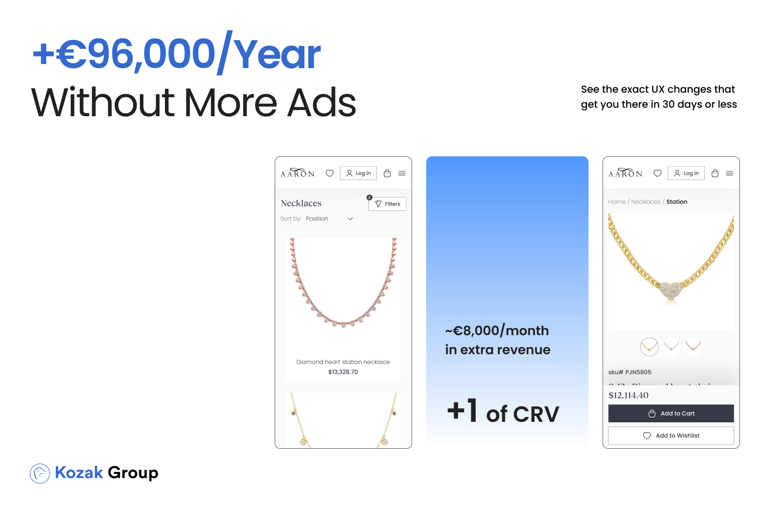
- If your current mobile CVR is 1.5% and your AOV is €80, a 1% lift in CVR means roughly €8,000 in extra monthly revenue.
- Over a year, that’s €96,000 in additional sales, simply by optimizing the shopping experience for mobile users
The European fashion market is highly competitive. With ad costs rising and customer acquisition becoming more expensive, relying solely on paid traffic to grow revenue is no longer enough. Brands that win in 2025 will be those that turn more of their existing visitors into paying customers. And the fastest way to do that is by delivering a frictionless, trustworthy, and visually engaging mobile experience.
You don’t need a full website rebuild to see results. Often, the most impactful improvements come from targeted changes-simplifying navigation, surfacing size guides, reducing checkout steps, and ensuring images load instantly. These optimizations can be implemented in weeks, not months, and the ROI is often visible within the first 30 days.
If you’re unsure where your brand stands, the next logical step is to get a professional CRO audit of your mobile store. Our team specializes in fashion eCommerce conversion optimization and will identify exactly where you’re losing sales-and how to fix it.
Your competitors are already investing in mobile UX. Don’t let them convert the customers you’ve paid to bring in.
Book your CRO audit today and start turning more of your traffic into revenue-without spending a cent more on ads.


 AI Dealbot
